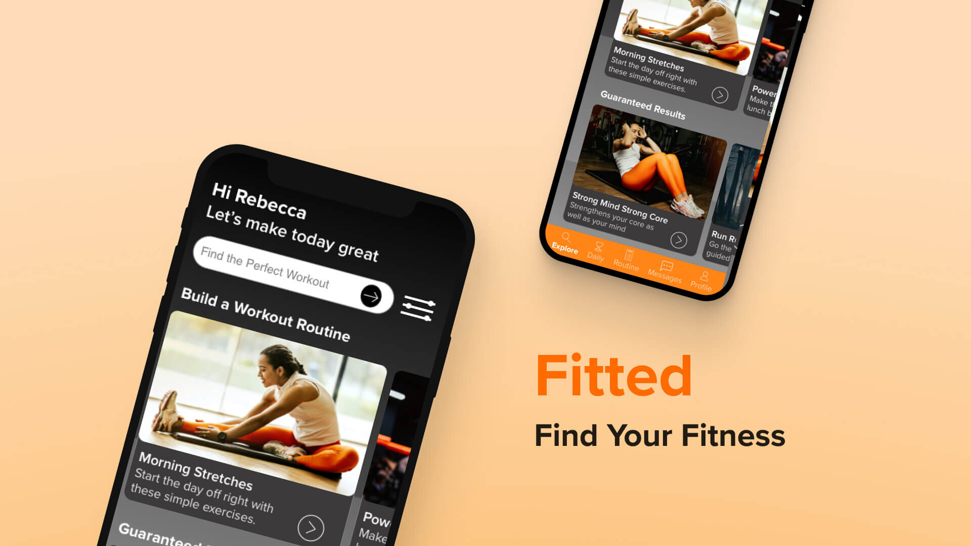
Fitted: Fitness App
UI Case StudyFitted aims to transform the way people think about fitness. In a saturated market, the challenge was to design a user interface that not only looked beautiful, but helped busy people take charge of their health.
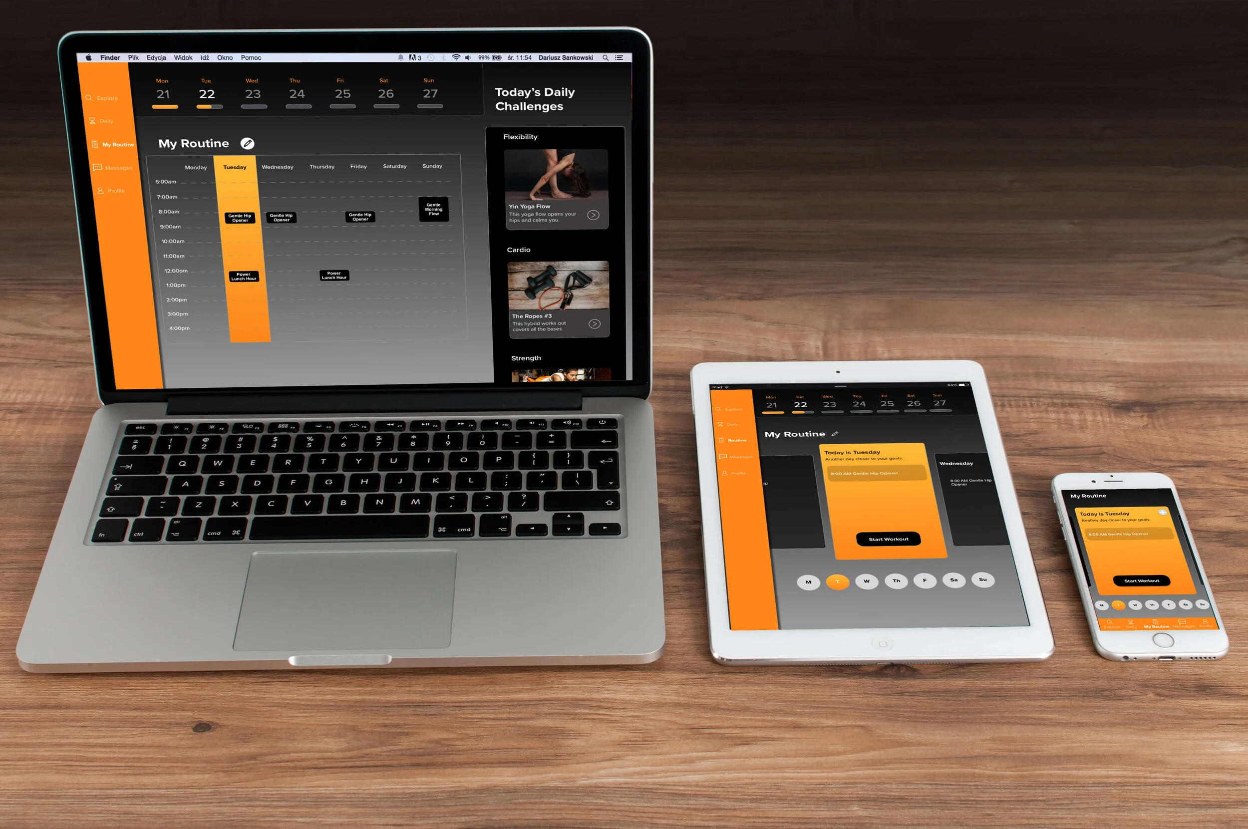
As sole designer, I drove the brand identity, persona development, and feature functionality for this cross-platform solution - including desktop, tablet, and mobile designs.
Meet Rebecca
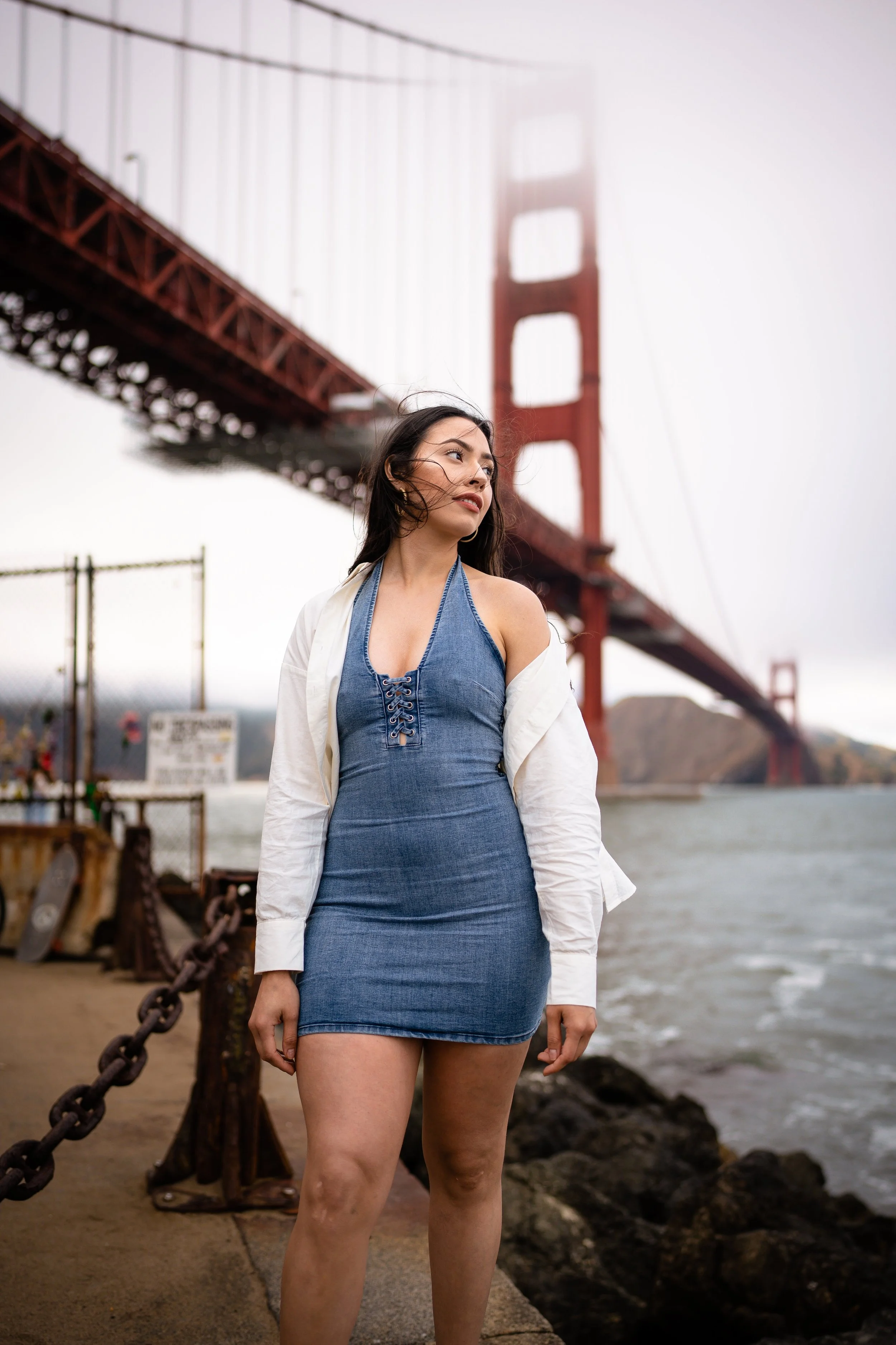
Rebecca is a software developer in her early 30s. She’s noticed that her sedentary job has affected her physically and mentally. While she enjoys taking walks and going on hikes in beautiful San Francisco, she’s a beginner when it comes to working out. Rebecca lives in a small apartment with her boyfriend and young daughter. She was recently told about Fitted by a co-worker.
Goals
Rebecca wants to lose weight and get in shape, as her sedentary job doesn’t allow a lot of time for exercising.
To help with this goal, Rebecca wants to find a tool that will help her fit exercise routines into her busy schedule.
As a beginner to working out, Rebecca also wants something that will help her learn how to properly exercise.
Rebecca wants help finding routines she can enjoy.
User Stories
As a new user, I want to learn about different exercises, so that I can figure out what is best for me.
As a new user, I want to be shown how the exercises are done, so that I know I’m doing them correctly.
As a frequent user, I want to be able to schedule exercises for working out, so that I can build positive habits.
As a frequent user, I want to be able to earn achievements or rewards, so that I can stay motivated.
As a frequent user, I want to complete daily challenges, so that I can have an additional way to stay motivated.
As a frequent user, I want to track progression and record what I’ve done, so that I can see my progress over time.
As a frequent user, I want to be able to share routines with my friends who may also be interested, so that I can encourage them to become healthier.
“I love the thought of having something that could work with my schedule. Being as busy as I am makes it tough to exercise otherwise.”
Designing
Task Flows
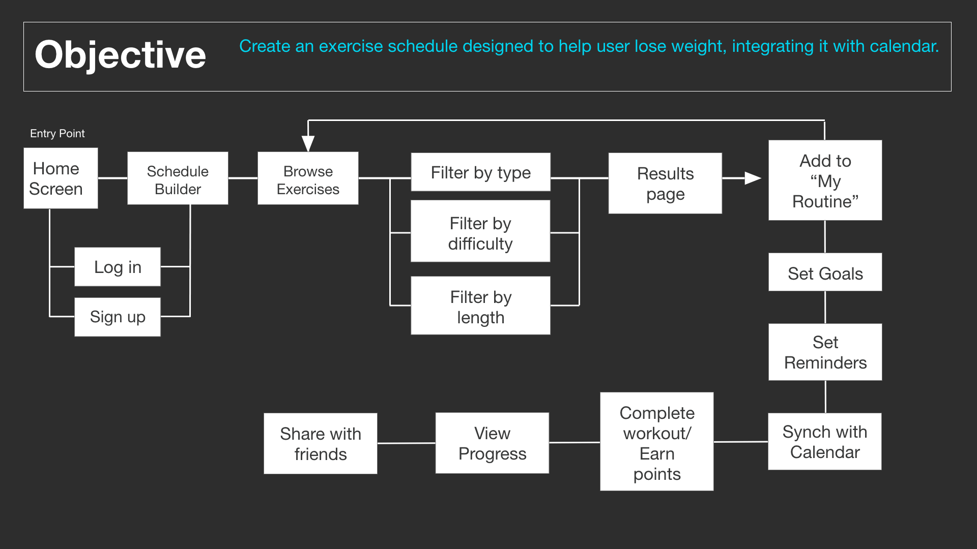
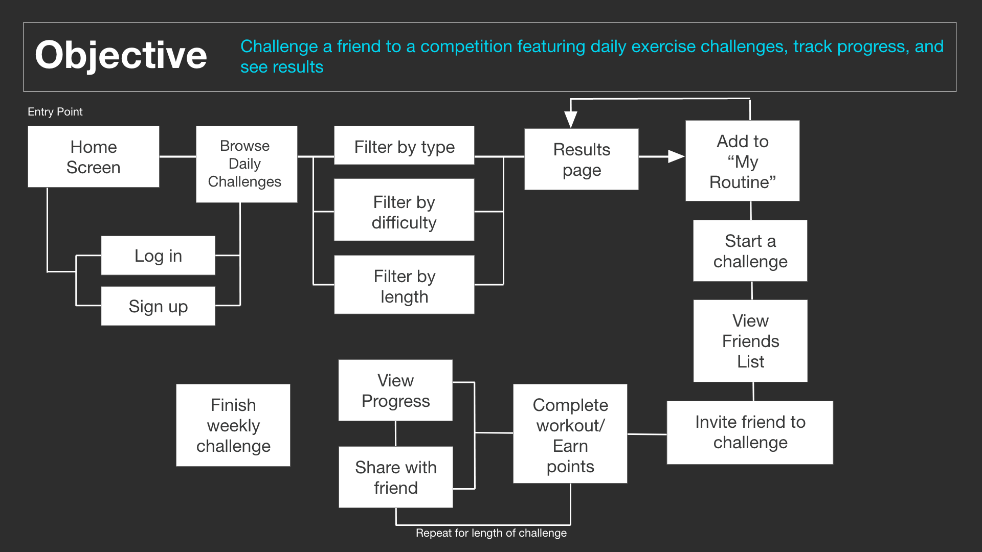
With a deeper understanding of the problem and the proto-persona, I developed task flows to begin the ideation process. Task flows inform the information architecture (or layout) of a project. By laying out each step users will take in achieving their goal, I generated ideas on how to best design each screen to make it as easy and enjoyable as possible for the user.
Low Fidelity Wireframes
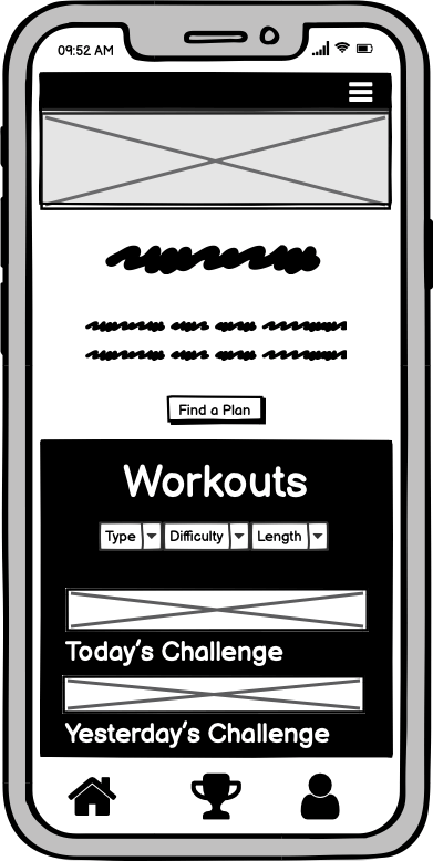
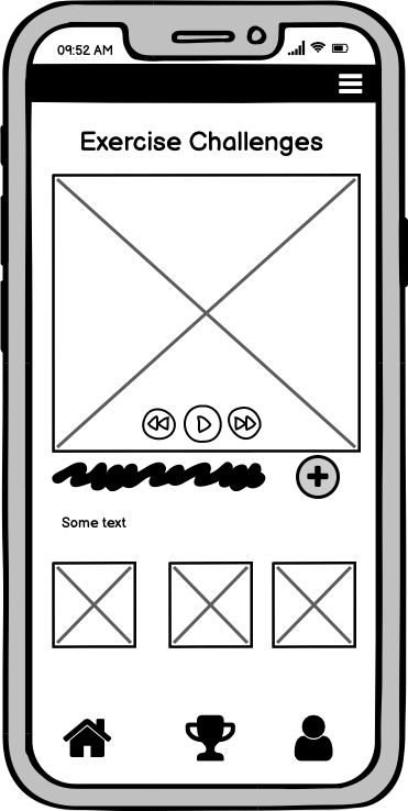
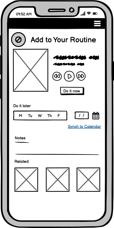
Next comes the fun part. After creating task flows based on my persona, I mapped out early wireframes of the screens using Balsamiq. These wireframes are the fields in which the user flows take place.
From the user stories, I developed wireframes to help Rebecca with the following:
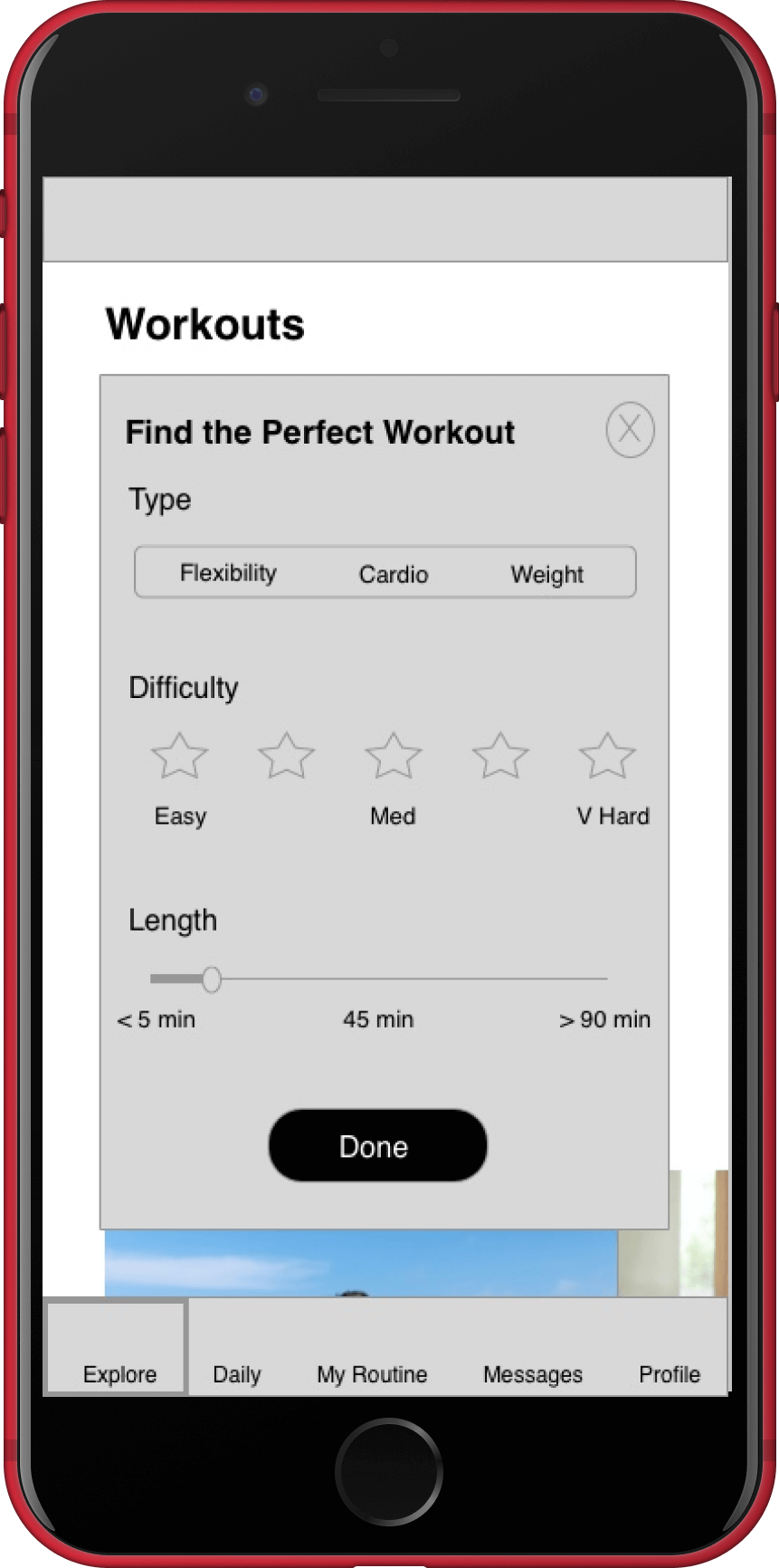
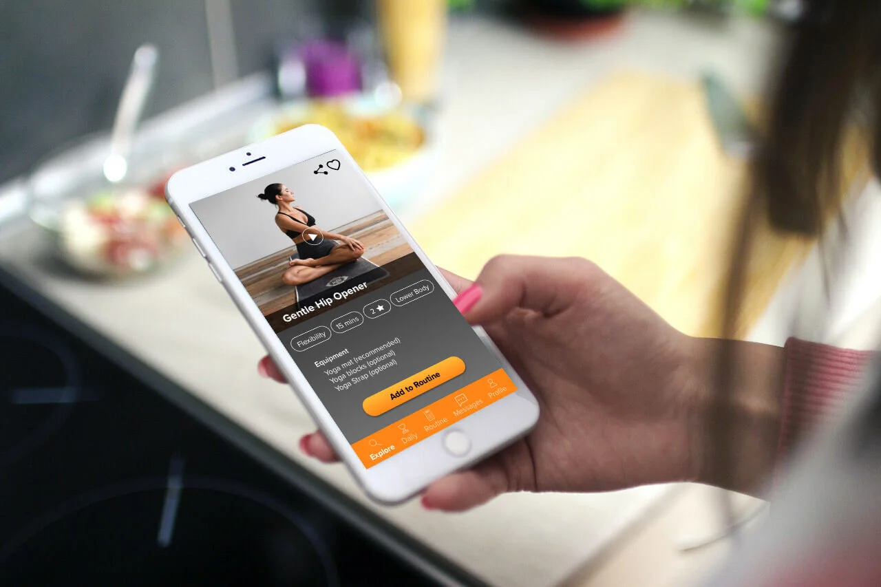
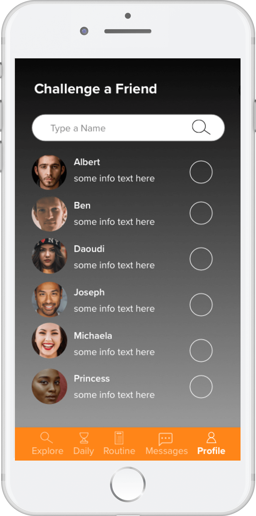
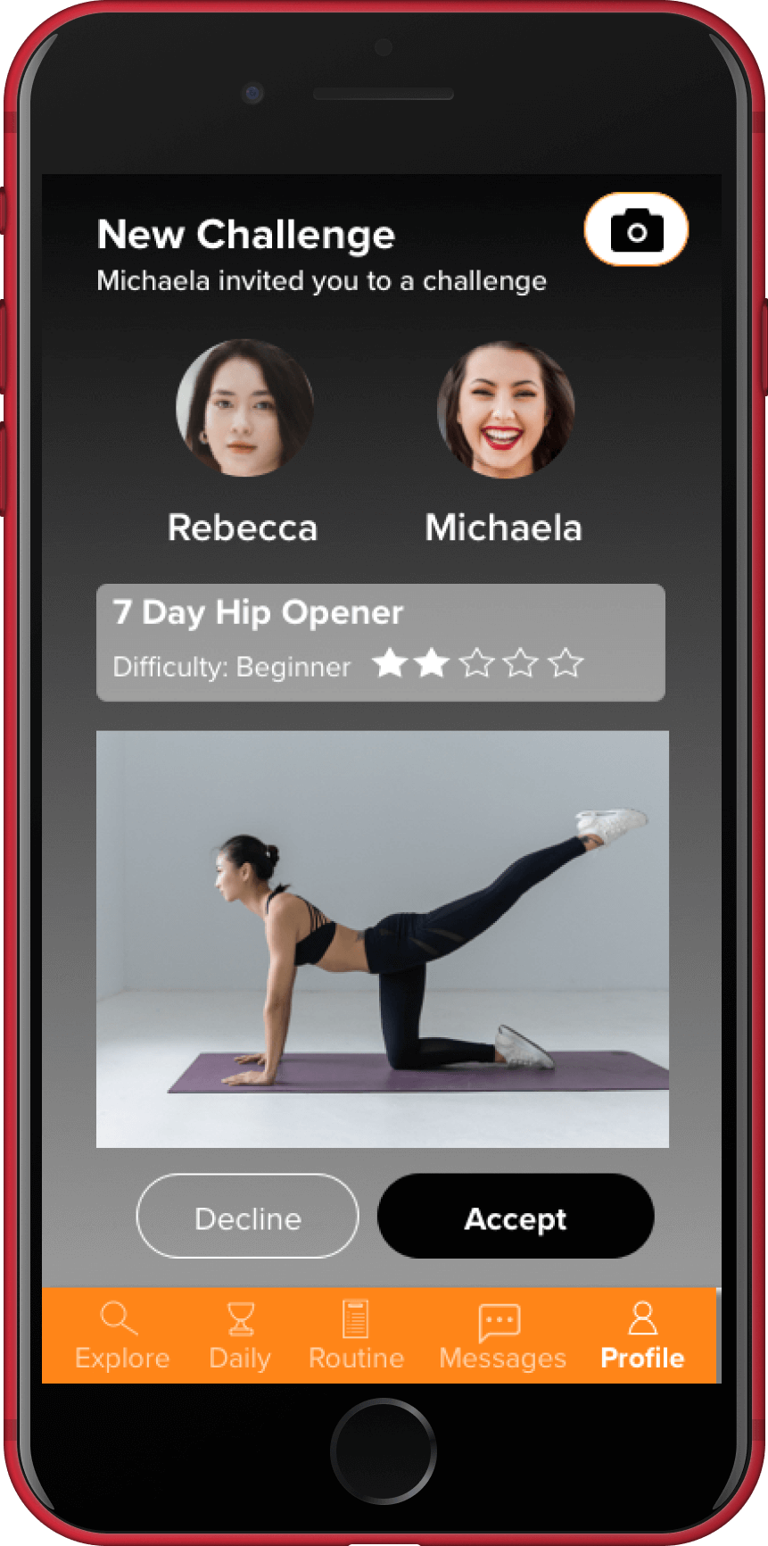
Search and filter workouts 2. Start a workout challenge (or competition) with a friend 3. View a video tutorial of the workout 4. Add the workouts to a routine
Grids
With sketches quickly drawn on Balsamiq, I opened up Sketch to create a more organized view of these drawings using grids. I use a 12 column grid on my mobile design sketches because users are already familiar with this layout. This process is another opportunity for me to visually brainstorm my lo-fi wireframes.
Mid-Fidelity Wireframes
With the information architecture in place, I brought in interface design elements to make the app look more real.
As I increased the fidelity of these wireframes, I focused on the 6 following visual design elements:
Visual Hierarchy and Spacing
UI Design Patterns
Typography
Color
Imagery
Iconography
I like to keep things fairly big picture leading up to this stage, prioritizing layout decisions and planning interactions across each task flow.
Designing the “My Routine” page
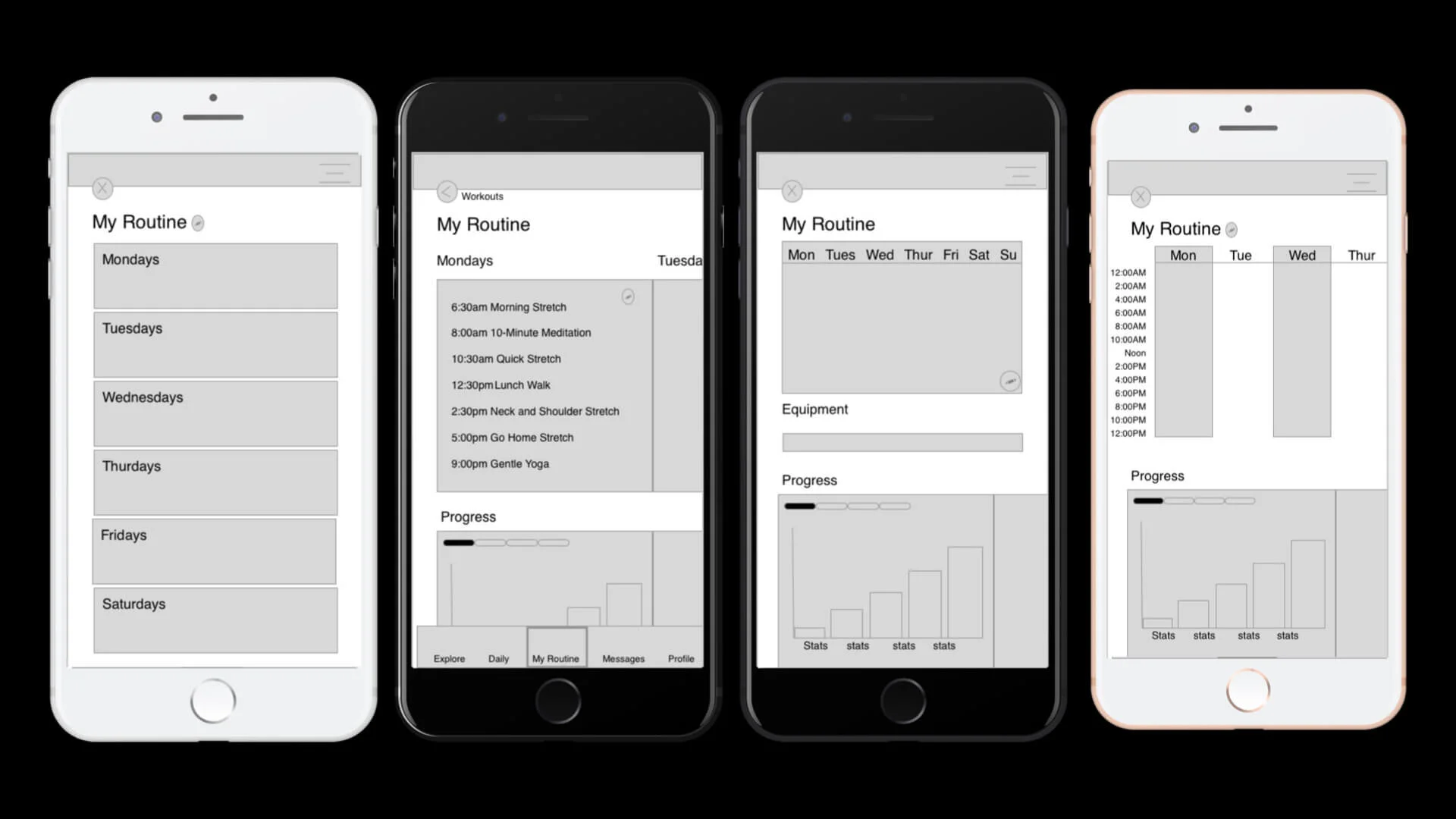
At the mid-fidelity stage, I came to a major decision point. There were many options that could work for the “My Routine” page . I asked myself “What is the user trying to accomplish on this screen?” What is the primary, secondary, and maybe even tertiary objectives with this page?
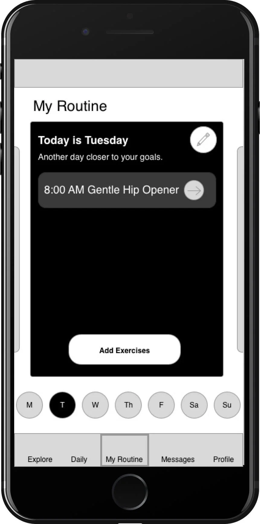
The overall objective of Fitted is to motivate people to workout. Fitness is a journey and it can get overwhelming if you think about all the workouts you have in front of you before your end goal. So I wanted to help users focus on today. That’s why the My Routine screen shows the users only what they have scheduled for today, with the main call to action being “Add Exercises”.
Note: The call to action was changed to “Start Exercise” in high fidelity wireframes.
alternative layouts for My Routine page
Final layout structure
High Fidelity Wireframes
The difference between mid-fidelity and high-fidelity mockups is simple. If it looks like an app that you would use, it’s high-fidelity. If the design isn’t there yet, it’s mid-fidelity. Most of the time, this comes down to refining the details of visual design.
The guiding question is always the same: How can I remove obstacles for the user? Here’s an example:
The first major change was to add a dark grey gradient to the background. This gradient adds a more polished, defined look for the app.
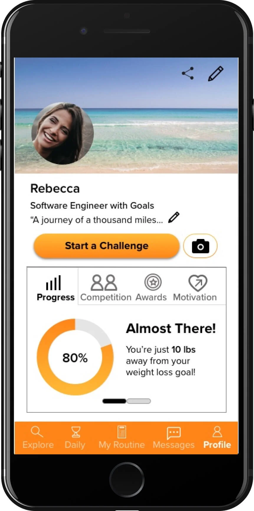
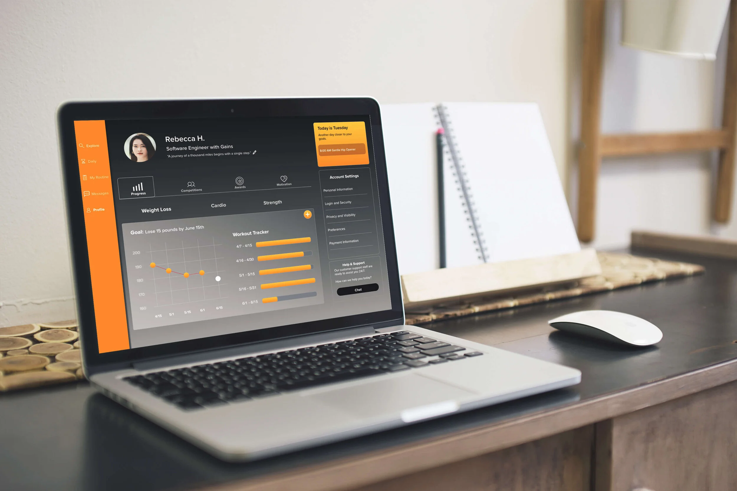
The next change was focused on improving the visual hierarchy of this screen. I asked myself “What is the user trying to achieve?” They want to see their progress. So I gave this content more space and reduced the size of the banner image and header text to help bring the user’s attention directly to the data.
I also changed the data visualization. Rather than showing the user's progress on one goal at a time, I opted for a layout that allowed the user to see their progress on each of their goals all on one screen. This helps with the efficiency of the screen.
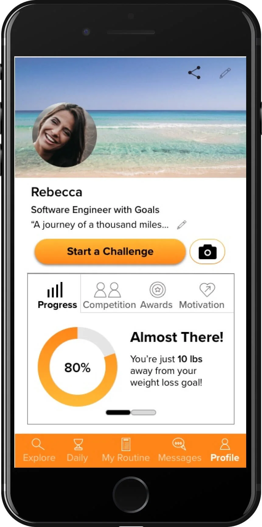
I changed the primary CTA on this screen from “Start a Challenge” to a plus button. This plus button allows the user to add a new goal, which is more relevant to the rest of the content on this screen.
Mid-fidelity wireframe of the Profile Page
High-fidelity wireframe of the Profile Page
Conclusion
This design successfully motivates users to reach their fitness goals by forming a cohesive brand identity. This was achieved by maintaining a fairly limited color palette, consistent design elements, and encouraging UX writing - guiding users to create a workout routine based on their skill level and interests.
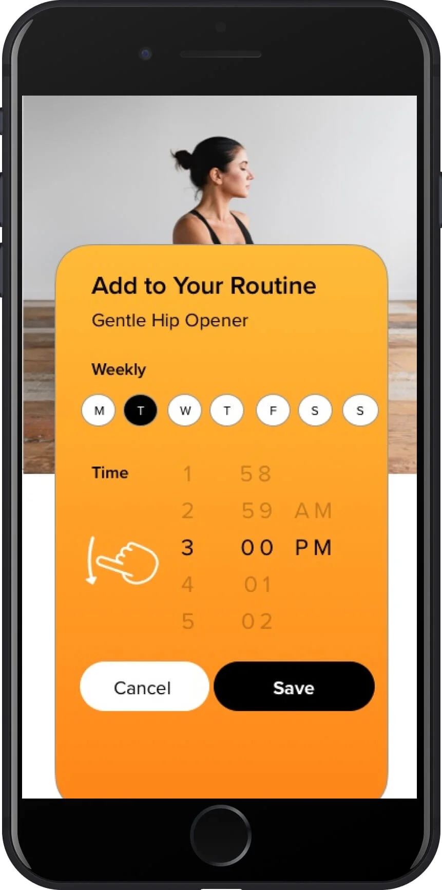
Users can easily find the perfect workout using the search and filter features and then quickly add them to their weekly routines.
Users can set fitness goals and see their progress on their profile page. These goals are helpfully categorized by fitness outcome.
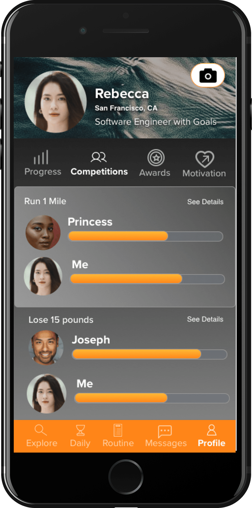
If users need more external motivation, social features such as competitions and daily challenges offer just that.
Next Steps for This Project
Interactions - I would love to spend more time working on this app’s animated interactions. There is a lot of potential to create engaging, useful, and fun animations to give this app even more personality. This app was prototyped with InVision Studio, which is has a frustrating amount of limitations compared to Adobe XD.
Activities - While this app succeeds in helping users add workouts to their routines, there is definitely space to bring recreational activities into the picture. I’d love to conduct some more user research to discover user preferences. I’m curious to know what value add this app could have for people new or returning to fitness. Do they already have exercises built into their daily life? How could this app contribute to those activities.
Lifestyle Optimization- Along those lines, I think there is potential to build the customization experience. I’d love to explore how we could learn more about our users day-to-day life and optimize their workout routine for them personally.
Have questions about this project? Drop me a note.
