aptitude
UX Case Studyaptitude (intentionally lowercase) is a transformational force in the healthcare supply chain industry. By leveraging big data and an extensive product catalog, aptitude tilts the scales back in the favor of hospitals when it comes to contracting supplies and services. aptitude offers buyers and sellers a wide variety of data sets to optimize their supply chain across their portfolio.
Users on both sides of the supplier chain need a way to view how their business is trending at a high level. Previously, the process of measuring the performance, contract compliancy, and growth/savings potential exist on the contract level, users need a broader view.
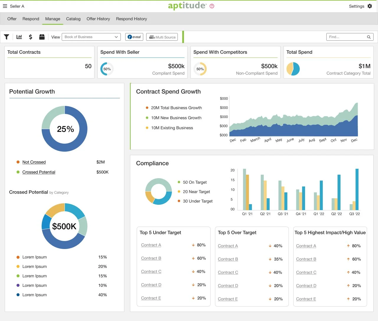
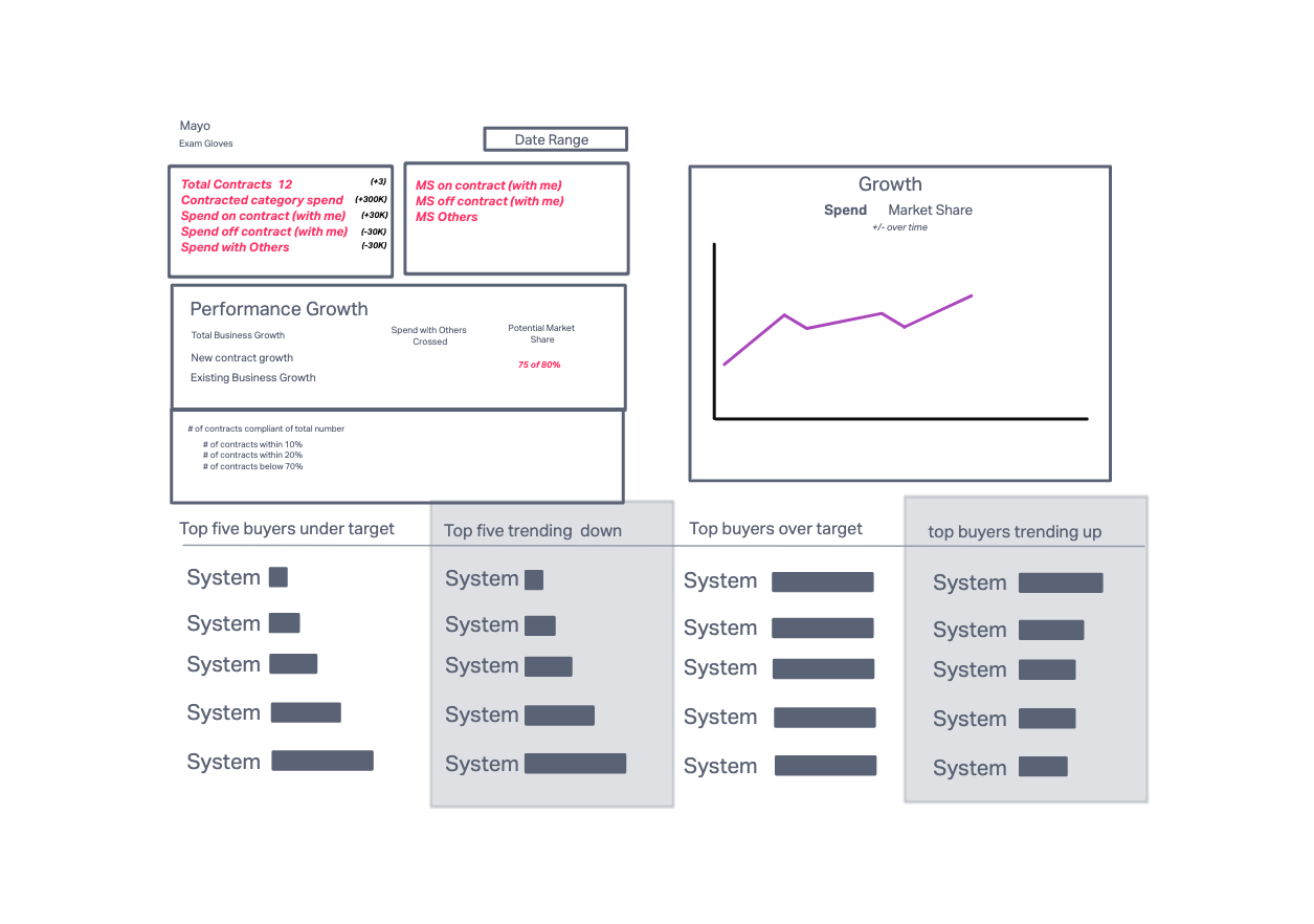
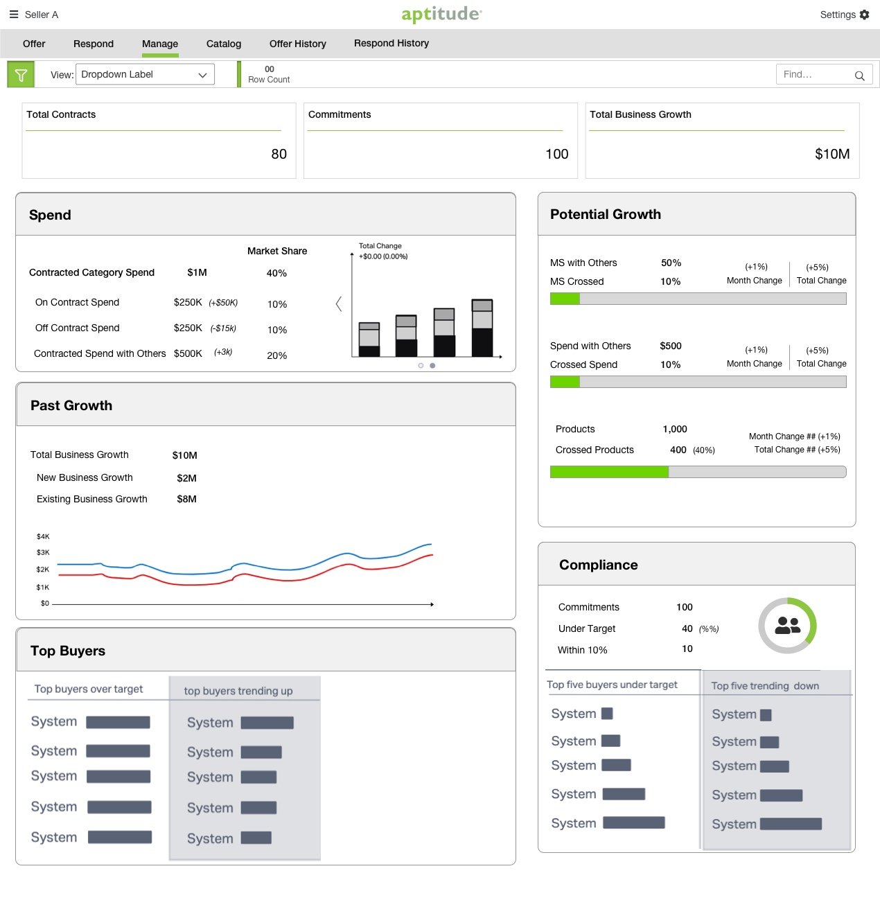
The aptitude Book of Business - a superpowered dashboard where providers and suppliers can view their business at a high level with actionable insights. Key data points from contract measurement were aggregated to show overall growth, progress towards compliance, and key areas for growth/savings.
Discovery Research
The main objective of the discovery research was to understand how different personas would understand the question “How is my business doing?” We investigated how this answer may vary depending on the user’s role. We talked to team members whose expertise was in helping our users make sense of their business.
How are they communicating the overall health of their client’s business?
What data points are buyers asking them about?
How does that differ from what sellers are interested in?
The results from this exercise allowed us to begin conceptualizing the design.
Problem Statement
Users need a way to view how their business is performing at a high level. Sellers want to know if their business with a particular buyer is growing or shrinking. Buyers want to a way to visualize their spending trends.
Hypothesis Statement
We believe that by creating a dashboard, we can give both sides of the supply chain a powerful tool for measuring and assessing their overall business, particularly in terms of performance and compliance.
We believe that by displaying the trends in their market share, spend volume, and contract volume will allow sellers to understand their growth and find new opportunities.
We believe that buyers showing buyers trending information for their spend, savings, and allow them to quickly take action to reach compliance.
User Stories
“I want to know if I am gaining more market share this year that I was last year. ”
“ I want to view how a group of contracts within a particular category are performing compared to last year.”
“ I want a visual aid that focuses our business reviews with our suppliers and help them become compliant.”

Task Flow
The first question that came out of this project was, “Where is this going to live?”
To find a logical home for this new dashboard, I laid out a task flow based on user insights.
This book of business could be dynamic and respond to a wide range of needs by rolling up the contract level data that current exists on the Manage page.
Information Architecture
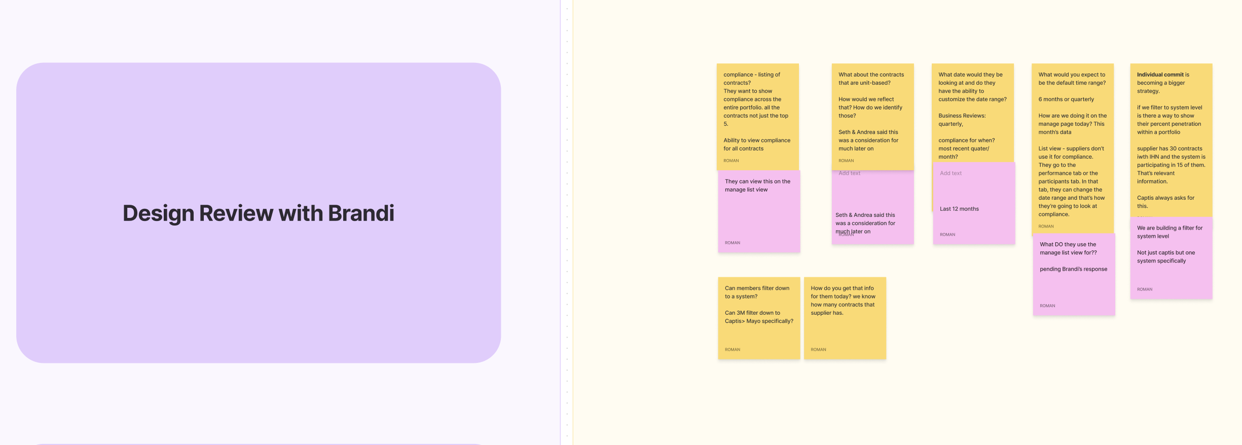
Once we had decided where the dashboard would live, we began to map out how to present the data points that users need to understand their business.
In collaboration with the Director of Product Strategy, I began to organize the data points to tell the story of “How is my business doing?”
Rapid Prototyping
With the key data points grouped and accounted for, I began to bring in common UI components to build wireframes. This allowed us to tell the story visually in an easy to understand way.
It also presented some of the biggest challenges of this project.
How do we avoid cognitive overload? Are all of these pieces necessary? Are any pieces of the story missing?
After consulting with the VP of Operations to ensure that our design satisfied aptitude’s business needs, I turned to usability testing to gather data on how we might improve this design.
Usability Testing
I believe continuous research and testing throughout the design process yields the best results.
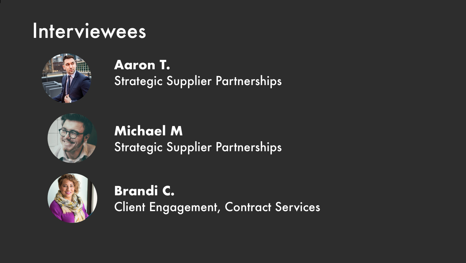
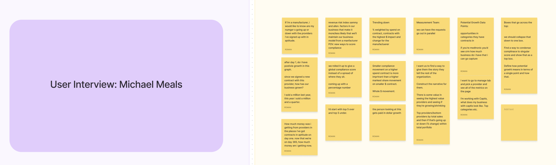
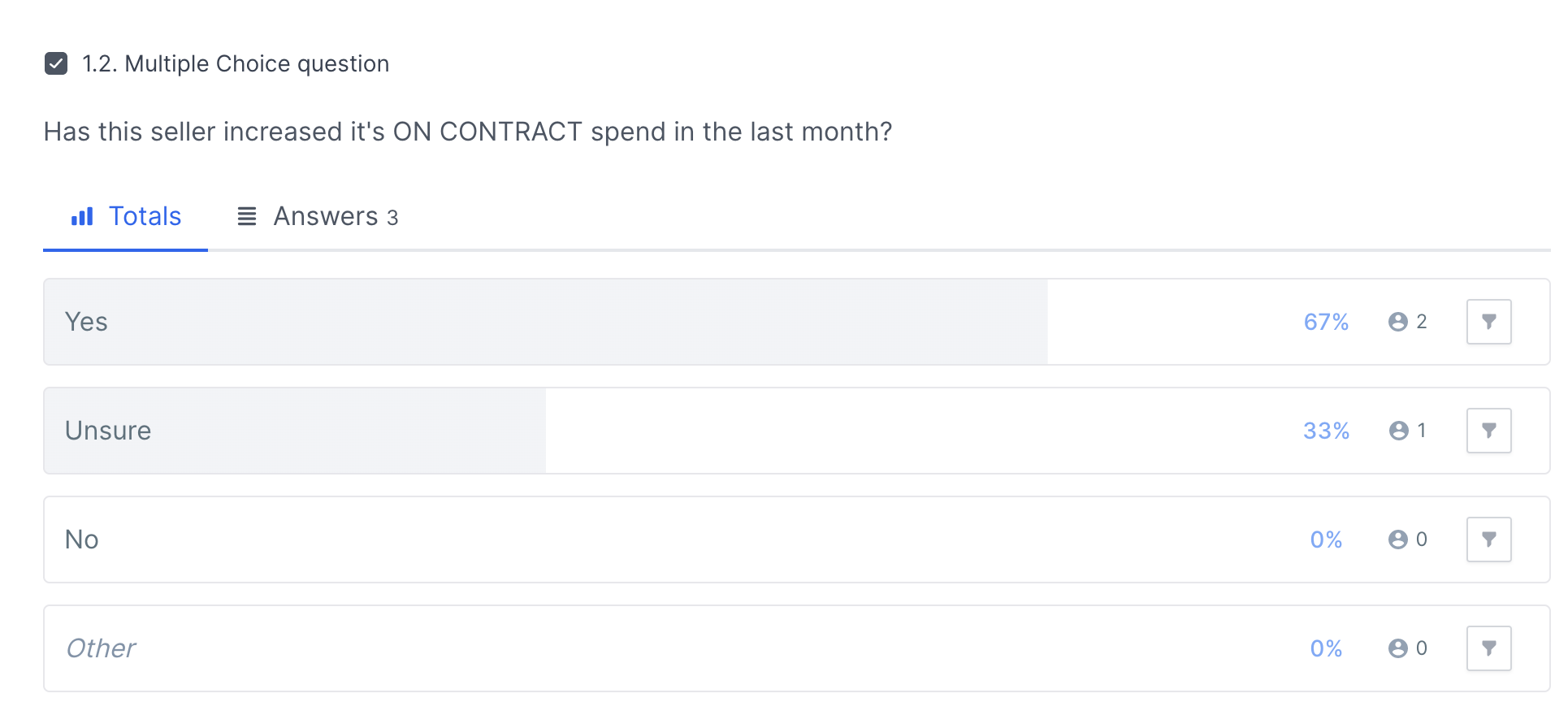
We came back to our interviewees and ran qualitative and quantitive experiments.
Using usability testing software, I devised an experiment to evaluate the users comprehension of the design. Can they accurately interpret the data on the screen?
I also sat down with the participants and listened to their impressions of the dashboard.
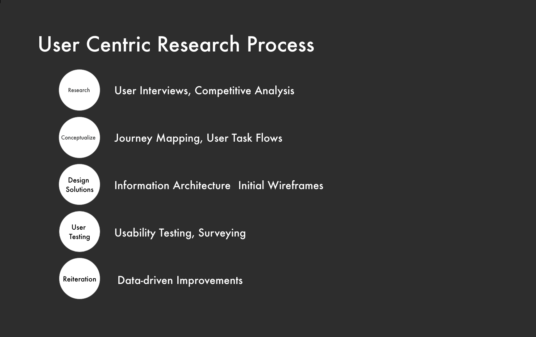
Reiteration

Outcome
By creating a dynamic dashboard, we allowed users to answer the question of “How is my business doing?” based on insights from continuous user research and testing. Suppliers can now see high-level trend information about their contracts’ performance as well as identify key areas for strategic growth. Providers can view month-over-month data on their savings and spend data, as well as quickly analyze their compliance for meeting contract agreements.
Taking the qualitative and quantitative data from usability testing, I collaborated with another visual designer to increase the fidelity of the mockup as well as re-design the data visualization to address any confusion expressed by testers.
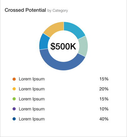
One of the major findings in testing was users wanted a more-detailed breakdown of the “potential growth” section. By adding a second pie chart that showed growth by category, we informed the users of where to focus their business.
Challenges and Obstacles
This project involved complex data that is highly industry specific. Learning the users’ language when it comes to how they understand their business was an obstacle. We overcame this obstacle through patient and thorough user research throughout the process, from discovery to usability testing and over again.
Another major challenge was figuring out how to show the users data that not only gave them a high-level view of their business, but also served as a reference point for their biggest opportunities for growth. We wanted this dashboard to inform users about the best areas to focus their energy.
Next Steps
While this project is off to an excellent start. We’re still not done.
I will continue to collaborate with the visual designers on out team to refine the UI components.
We also have to present the high fidelity wireframes to our developers and work with them to overcome any technical challenges that may present themselves
This project is projected for release to production in July 2023.