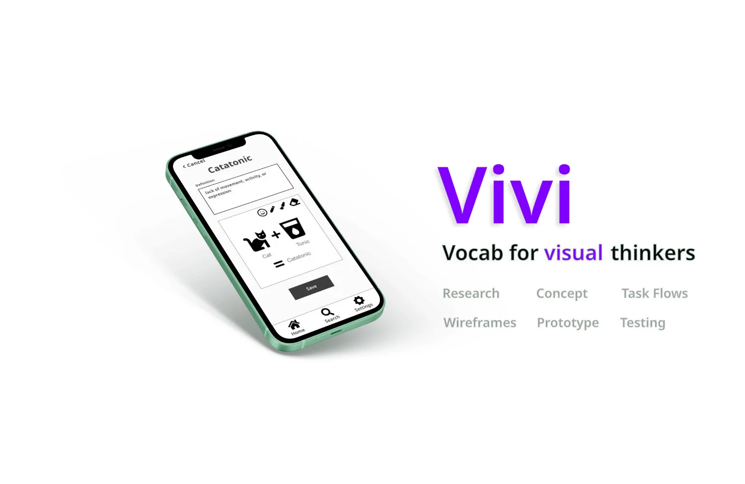
Vivi: Vocab for Visual Thinkers
UX Case StudyAsk anyone who’s studying vocabulary how it’s going and you’ll likely get an answer that starts with “I like it but…” It’s amazing that even in such a saturated, competitive market learners are still left feeling like there’s something missing. My task for this project was to investigate what apps are currently offering, identify a missed opportunity, and to innovate a solution that fills a real user need.
Context
This project was completed in CareerFoundry’s Intro to UX Design course. I was the sole designer for this project and it was my first time turning low-fidelity wireframes into prototypes and conducting usability testing to validate their effectiveness.
The Challenge
Discover a missed opportunity in the vocabulary learning market and deliver a unique and useful app to fill this user need.
The Problem
Existing vocabulary learning apps fail to merge visual association, goal-oriented learning, and customization - leaving visual thinkers without a tool that fits their needs.
The Solution
Vivi (for Visual Vocab)- a versatile vocabulary app where visual thinkers can create custom vocabulary sets and quickly add images/ drawings to commit new words to memory quickly and easily. The app also includes visual representations of the users’ progress and study goals to keep them on track to reach their upcoming deadline.
Tools
Adobe XD
Adobe Indesign
Marvel
Zoom
Duration
1 month
The Process
User Research
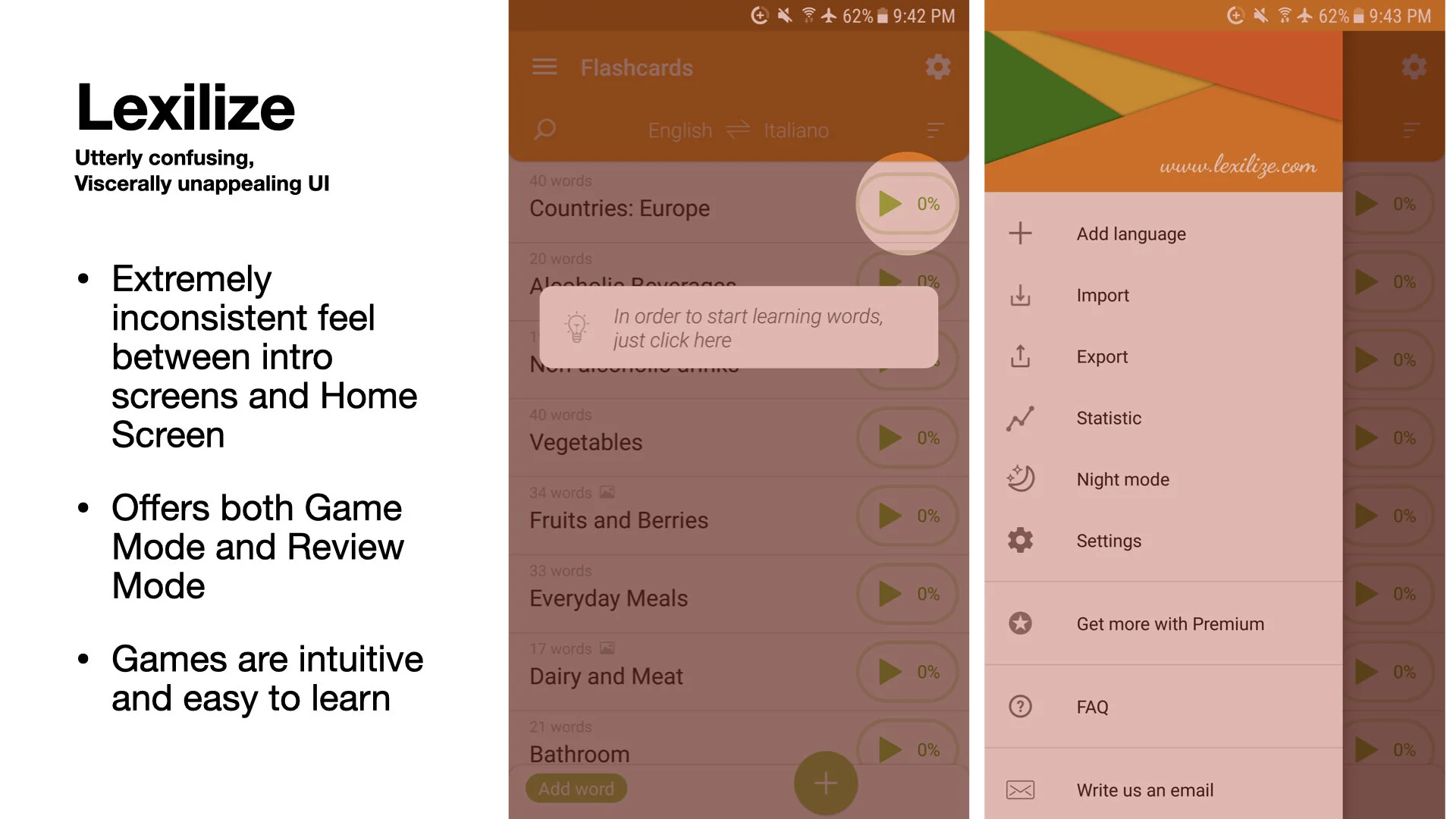
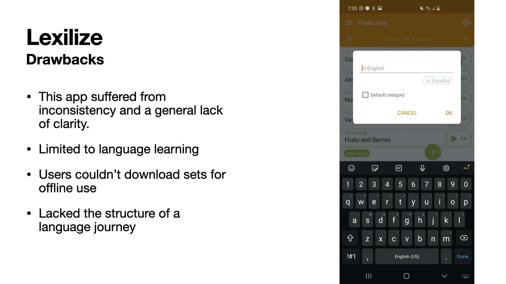
Competitive Analysis
User Interviews
Conceptualization
Persona Development
User Stories
Problem Statement
Hypothesis Statement
Designing
User Task Flows
Low-fidelity Wireframes
Low-fidelity Prototype
Testing and Reiteration
Usability Testing
Reiteration
Mid-fidelity prototype
User Research
To get a better sense of the vocabulary learning landscape, I performed a competitive analysis as well as user interviews. This gave me insight into what users enjoyed, disliked, and desired from existing vocabulary apps.
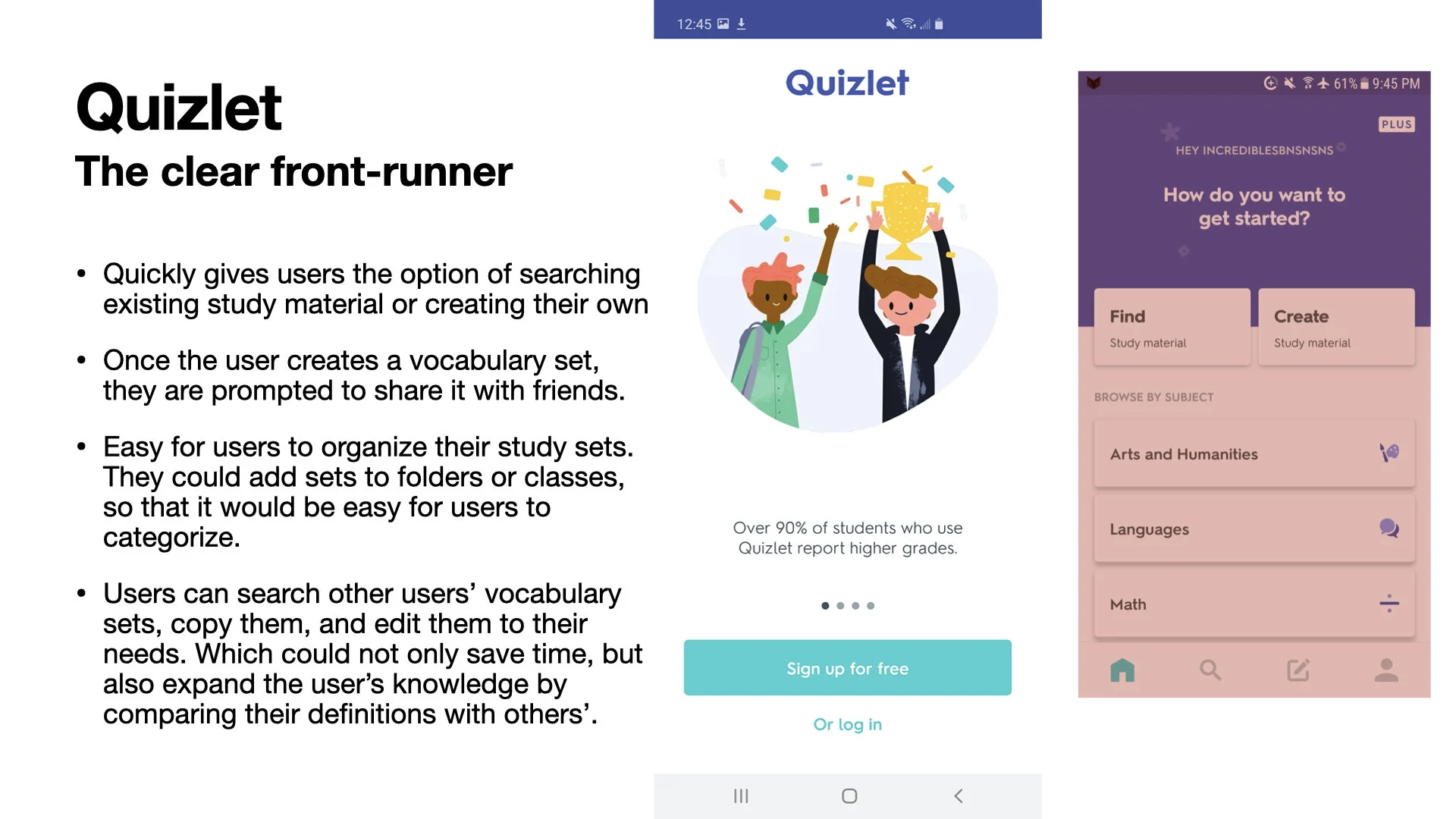
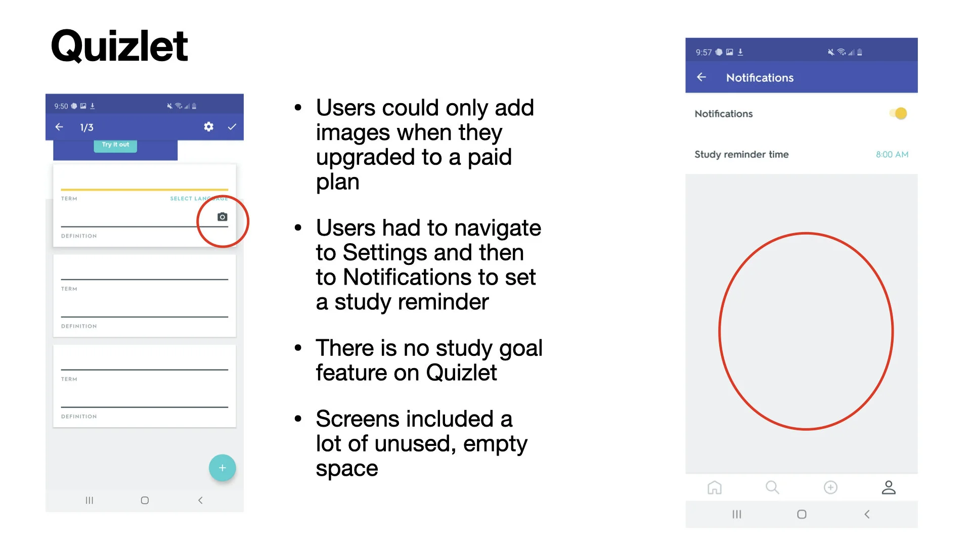
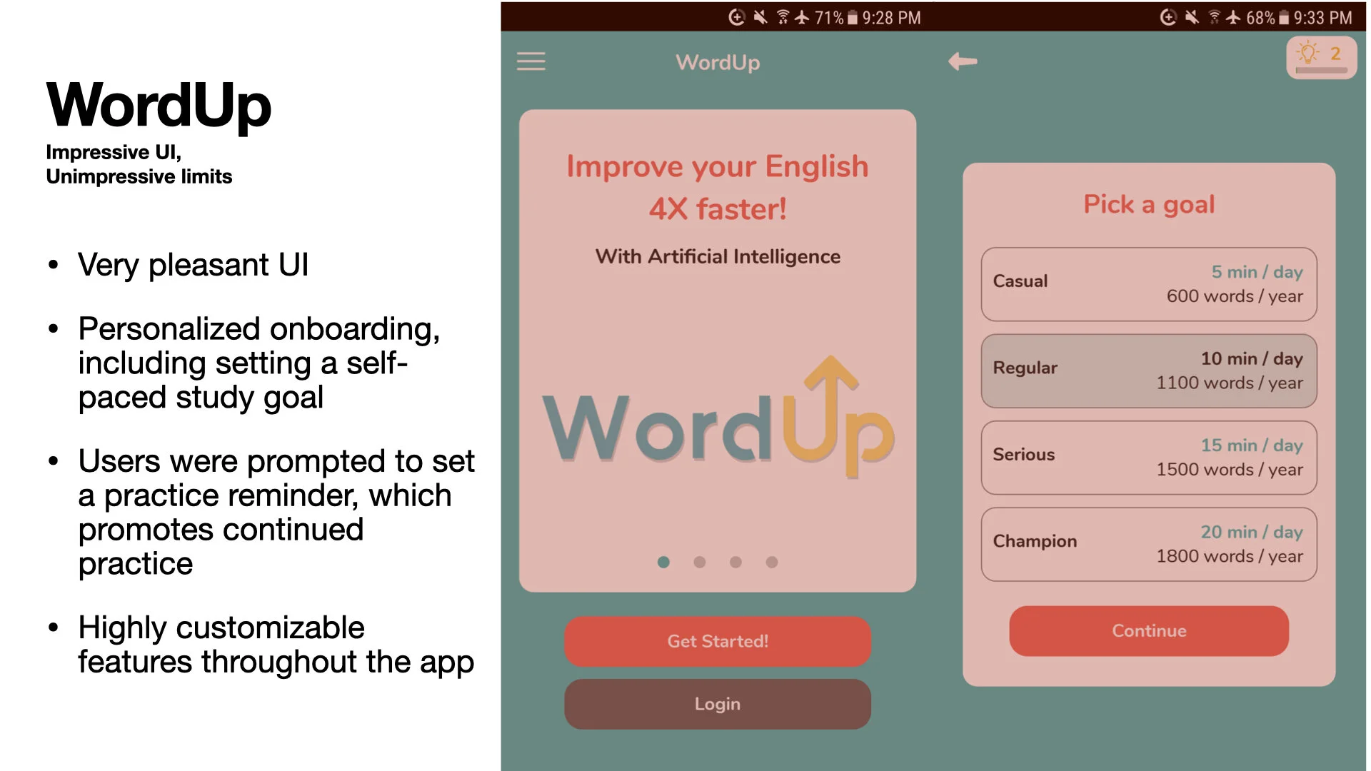
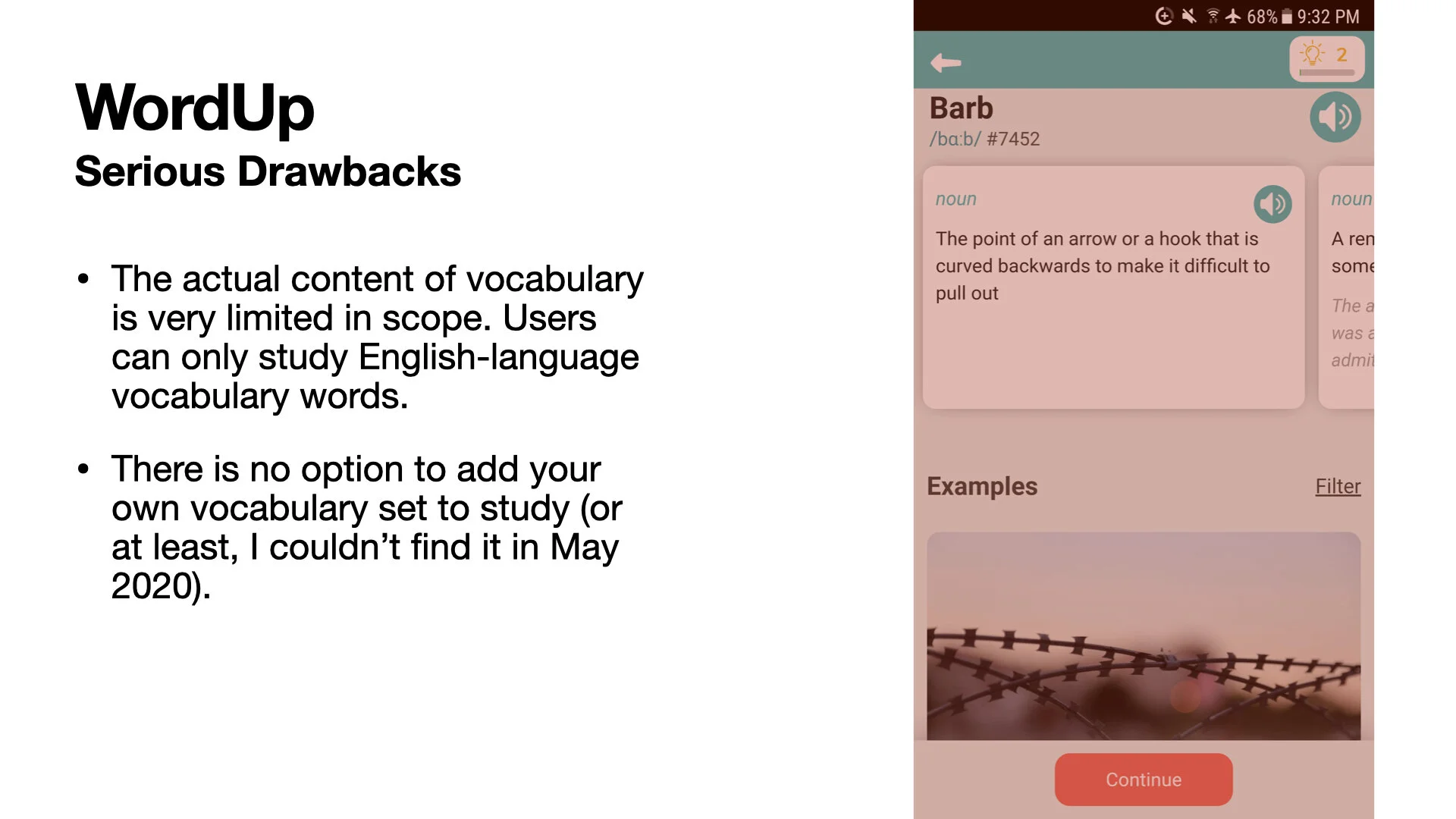
Despite a saturated marketing, existing vocab apps fail visual thinkers in one of three ways: not using visual association, not reinforcing positive study habits, or poor UI. User Interviews showed that users desire clean interfaces, structured learning, proof of progress and visual association tools while learning new vocabulary.
Competitive Analysis
I chose 3 different vocabulary learning apps: one for building vocabulary in general, one for learning specific vocabulary words, and one for language learning. I included the pros and cons of each, as well as a summary of whether or not the app met the goals of UX design's 3 main elements: utility, easy of use, and efficiency.
User Interviews
“I create a sort of ‘mind palace’ where I make a little drawing for every word to build associations. For Noam Chomski I would draw a gnome, then a mouth chomping, and then a pair of skis. I liked having an image go along with the word. If I could think of the word, I could think of the image and that helped me remember.”
This quote from Blaze was my “AHA moment” during the project. Blaze shared an actual study habit he created to fill a gap left by existing vocabulary apps. This insight gave my project direction and I set out on a mission to transform it into a useful and easy to use tool for users like Blaze.
Major Takeaways:
Users who are visual thinkers supplement existing apps with their own study practices
Users prefer a clean UI with minimal distractions
Users want a visual representation of their progress
Most users have a motivation and deadline for the vocabulary they’re trying to learn
Studying is a fairly social activity
Users search for existing vocab sets that can be copied and edited because they have specific vocabulary to learn.
“I usually start by searching for an existing study set, copying it, and editing it to fit my needs.”
“Initially I felt resigned, overwhelmed, and daunted at the idea of having to study, but when I saw that there was a structure in place to help me study.. I felt relief. I felt like I could do it. ”
Conceptualization
Proto-Persona
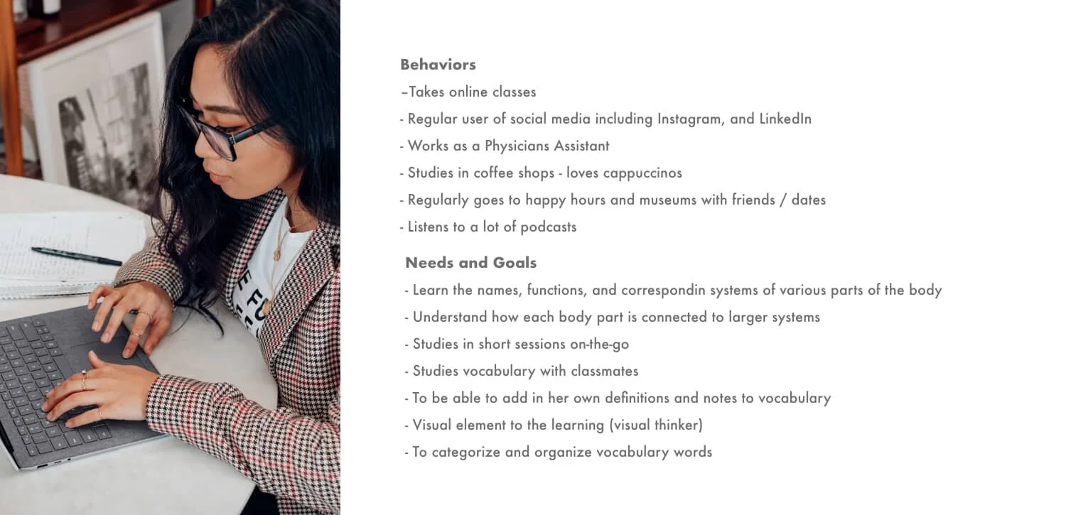
Meet Jessica L., our proto-persona produced by the insights gained from user research. She represents the goals, pain points, and behaviors of our target audience.
26 years old
Female
Asian-American
Student in the Medical Field
Works Full time in field
Lives in Minneapolis with her dog Billy
“I need a way to learn the complex vocabulary quickly and efficiently. There are a lot of vocab apps out there, but none are really made for me, as a visual thinker.”
User Stories
“As a student, I want the ability to share my vocabulary sets with classmates, so that we can study together.”
“As a visual thinker, I want to be able to draw images, so that I can create mental associations between the vocab word and the image.”
“As a medical student, I want to organize the vocab words into categories, so I can focus on particular regions of the body at one time.”
The Problem Statement
Jessica needs a way to organize and visualize her work-related vocabulary. She is a visual learner and goal-oriented person who needs structure to overcome feelings of being overwhelmed by the amount of vocab she needs to learn. We will know this to be true when Jessica has a visual tool to help her learn her vocabulary and can set study goals to help her meet her deadlines.
The Hypothesis Statement
I believe that by creating an easy-to-use custom visuals for Jessica, I can help her learn her vocabulary quickly and lastingly.
I believe that by integrating study goals and reminders into each study set, I can help Jessica prioritize her studying and learn her vocabulary on time.
Designing
Task Flow
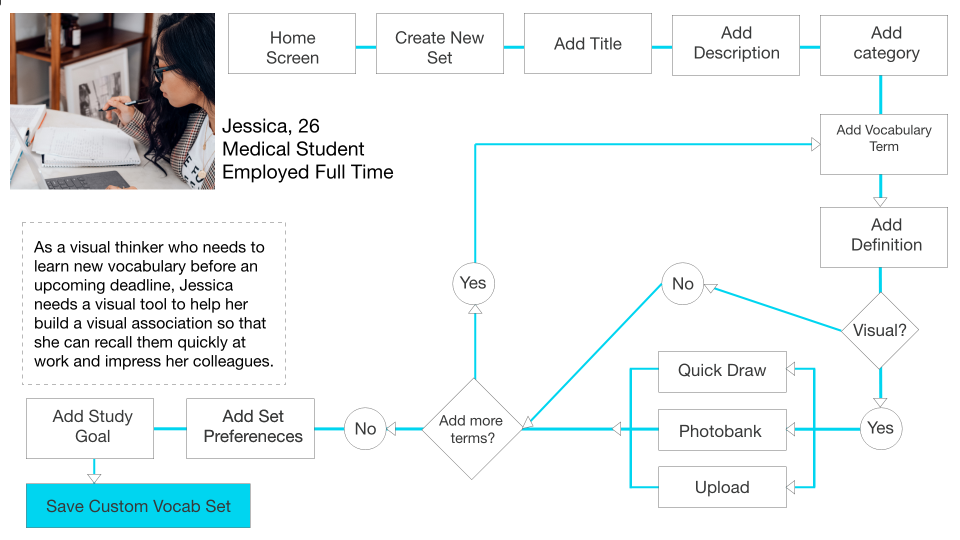
With a deeper understanding of the problem and the proto-persona, I developed task flows to begin the ideation process. Task flows inform the information architecture (or layout) of a project. By laying out each step users will take in achieving their goal, I generated ideas on how to best design each screen to make it as easy and enjoyable as possible for the user.
Wireframing
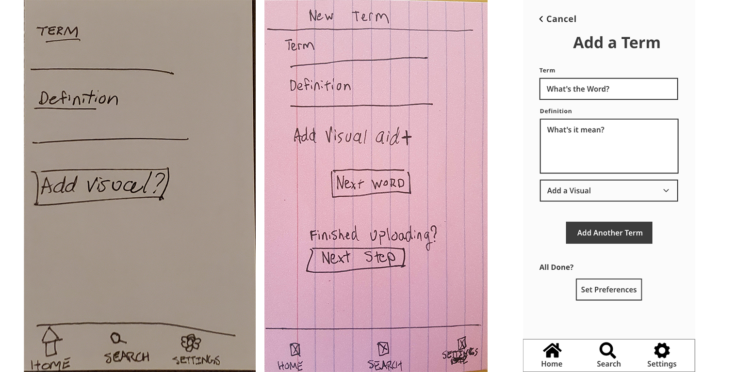
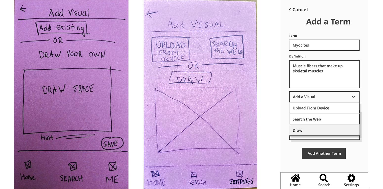
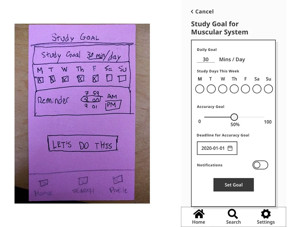
Next comes the fun part. After turning the research into a proto-persona and creating task flows, I mapped out early sketches (or wireframes) of the screens. These wireframes are the fields in which the user flows take place.
From the user research, I developed wireframes to help Jessica with the following:
Create a custom vocabulary set
Create a flashcard with a custom image
Set a Study Goal
Downloading the vocabulary set for offline use
Testing and Reiteration
Usability Testing
The big question when it comes to design is “How do you know that it works?” and the answer to that question is: Test, test, test.
After I developed some initial wireframes, I recruited 3 participants in the target audience for usability testing. Tests were conducted remotely over Zoom. I used Jakob Neilsen’s Error Severity rating scale to prioritize the severity of mistakes made by users. Details from the test can be found below.
Direct Tasks
Create a new set and add a title, description, and category.
Add a vocabulary word with an image on your device.
Add a weekly study goal for 30 mins/day on select days of the week.
Download a vocabulary set to your device for offline use.
Scenario Tasks
You are studying for an exam that has multiple sections to it. Create a study set for one particular section.
You came up with a helpful analogy for a particular term. Add an image that reminds you of that comparison.
You have decided to study 5 days a week for 30 minutes a day. Create a study goal and reminder to help you stay on track.
You have a plane ride this week and want to study your new set while you are offline. Download your set to your device.
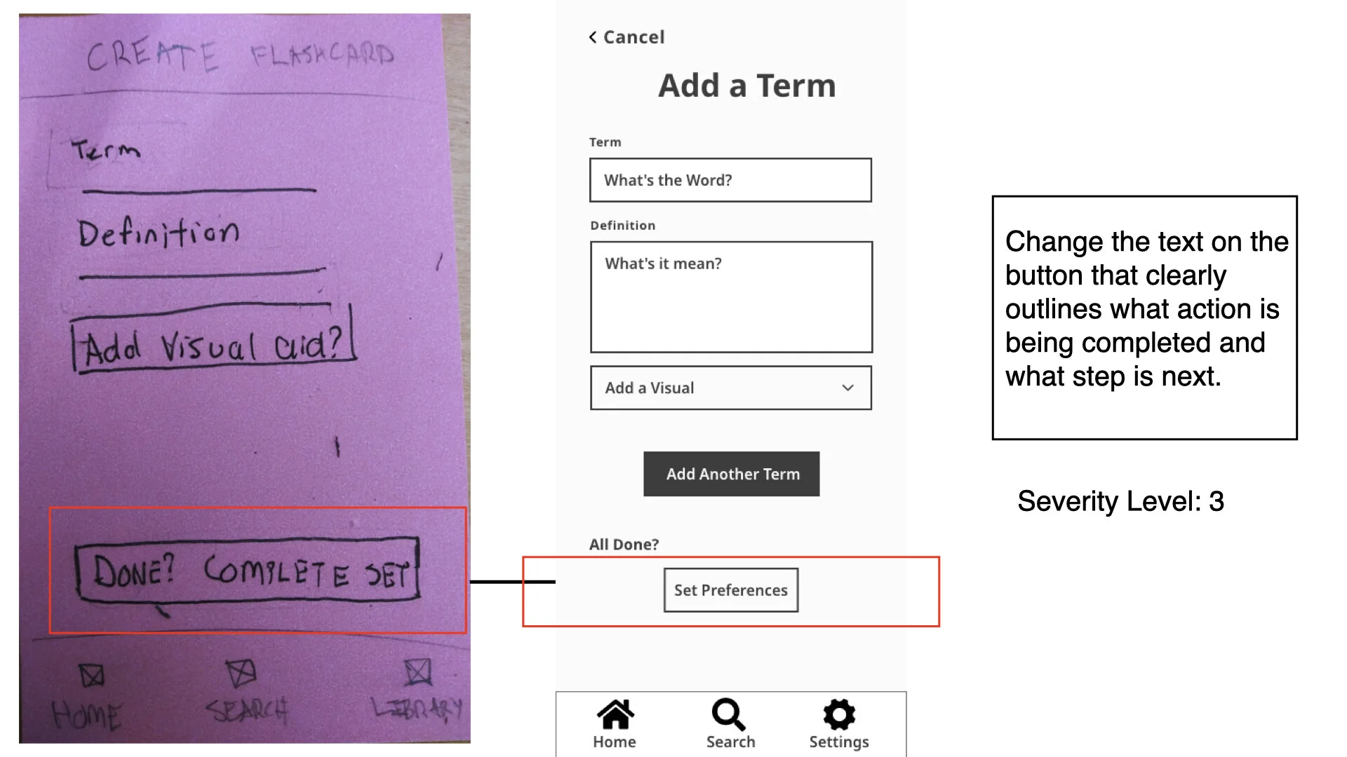
“Why did that button say “Done” when I wasn’t done?”
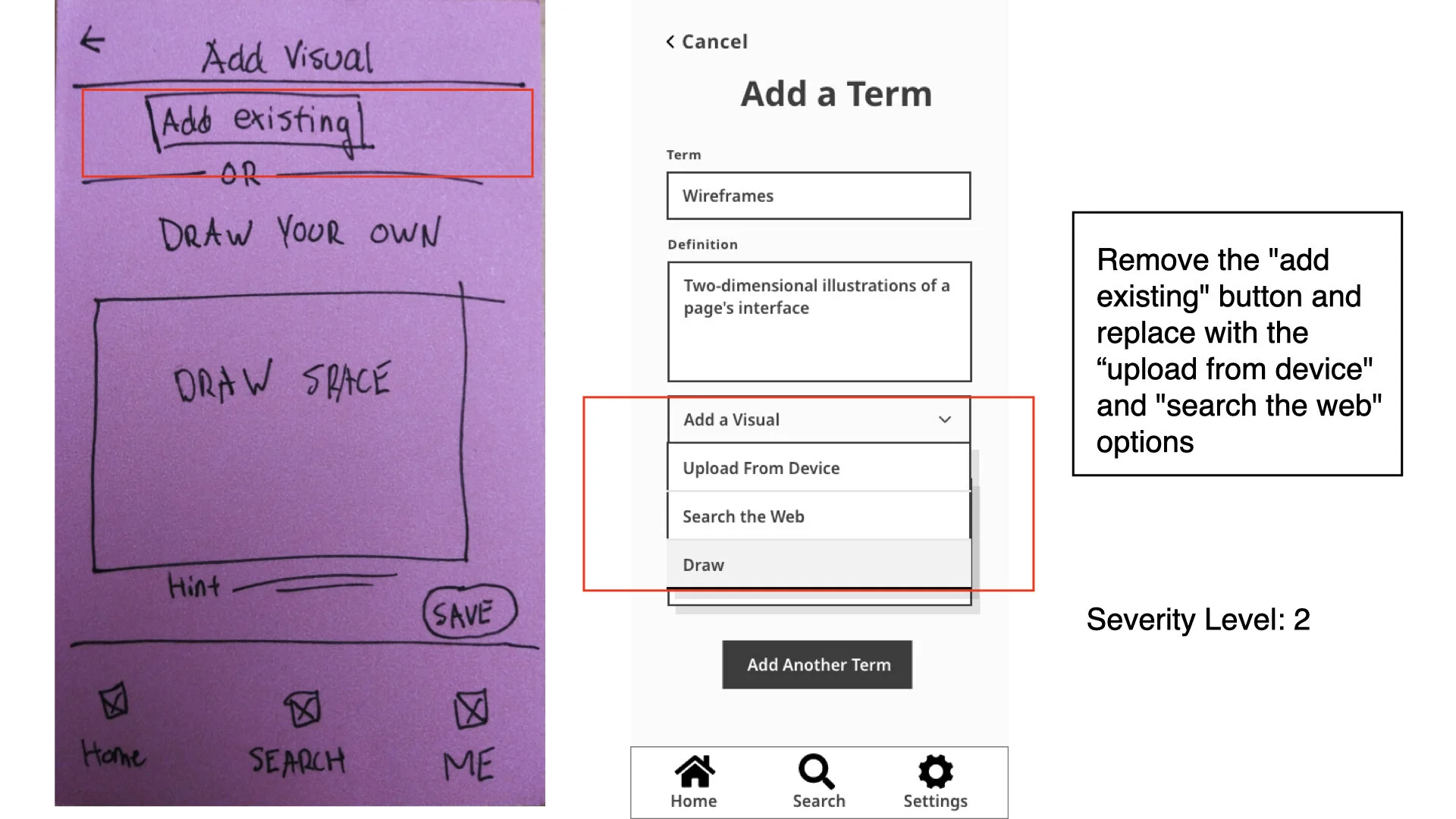
“This feels like a lot of steps for a fairly simple task.”
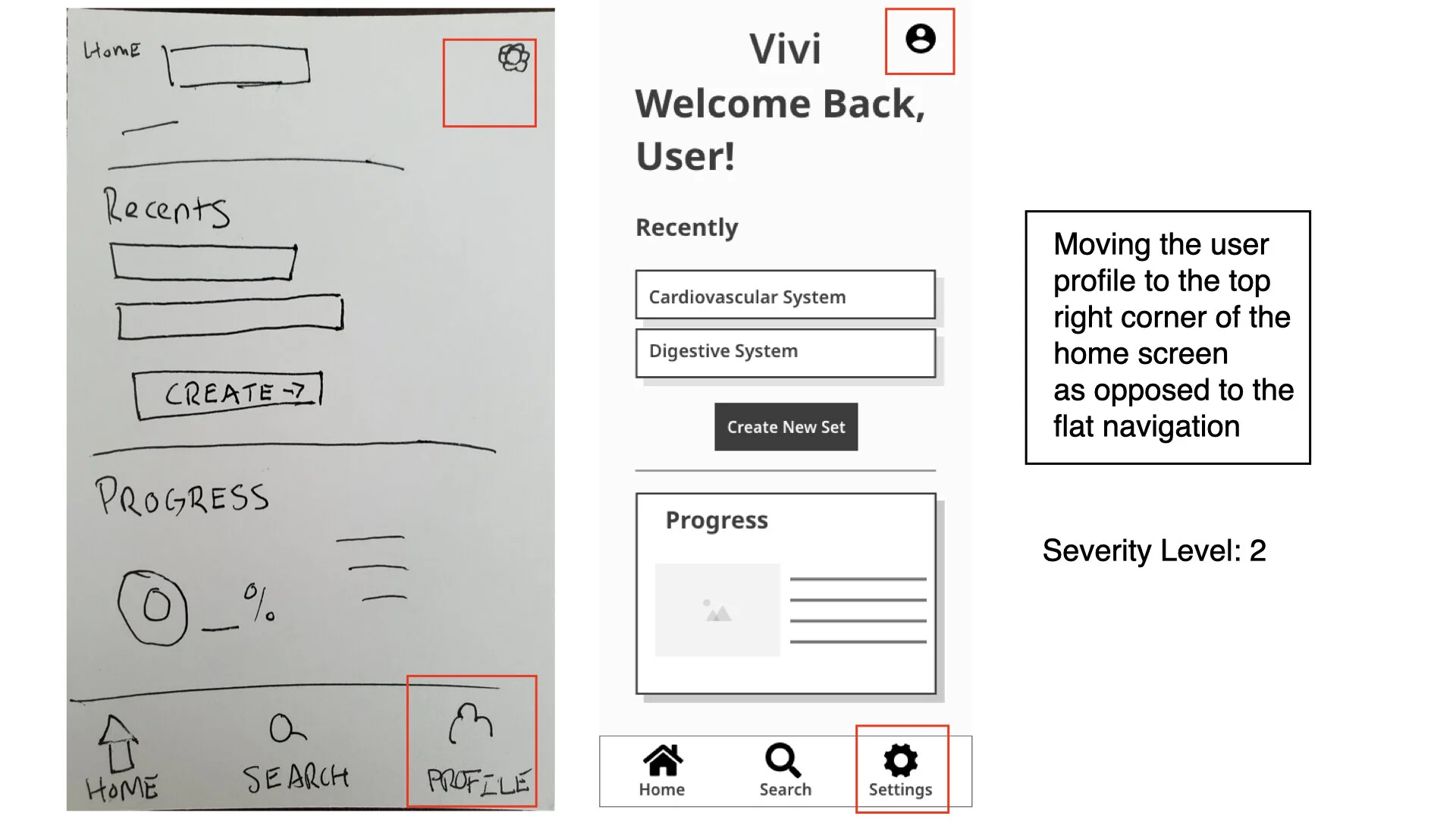
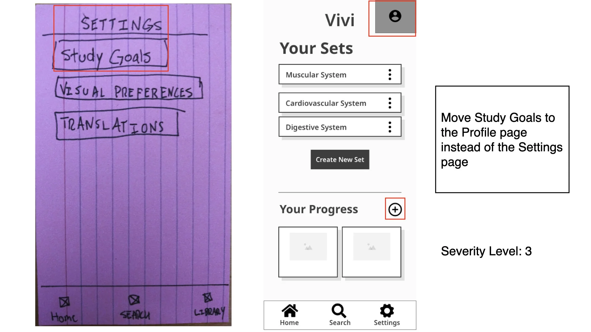
“I would expect study goals to be under my profile and not under settings.”
Users found the visual associations tools useful, but thought there were too many steps and screens to use it. They wanted to add words more quickly than what my first attempt offered, so I reduced the number of clicks as much as possible. I also made changes to the information architecture to meet user expectations for how to find features.
Major Changes
Swapped locations of Settings and Profile tabs to meet user expectations.
Clarified text on buttons to let users know what action was happening next.
Improved visual hierarchy/reduced the number of screens for adding a visual
Embedded study goals into the Create A Set process.
Moved “Add a Study Goal” from the Settings to the Profile page.
Conclusion
My favorite thing about this project was that I was able to make someone’s wish come true. Someone told me that they wished that there was a visual feature to build visual associations- and I was able to make that wish a reality. This is the gift and beauty of UX Design and part of the reason why I am so in love with the craft.
Challenges and Obstacles
This project came with its own set of challenges and obstacles. When I first received the project brief, I wasn’t immediately struck with several new ideas on how to break into this market. In fact, it wasn’t until the user interviews that I discovered the opportunity my competitors missed. That discovery came by listening. This was a major takeaway for me as a designer: Listen to the users. Ask follow up questions and don’t assume you know what they mean. Take the time to understand what it is they’re missing from existing apps and how you can avoid the same mistakes.
The challenges didn’t stop there, however. Once you have a direction for a project, you still need to design it and with that comes a whole set of user expectations and conventions that need to be taken into consideration. One of the most consistent errors that came up in the testing stage was users mistook the Settings icon for the Profile icon because they were used to it being in a certain location. This informed me that it is important to actively investigate user expectations early in the project to save time and resources during the usability testing stage.
Another serious constraint to this project was a short deadline and lack of budget. With more time and funds for testing, I would have developed additional features, specifically features that served the social aspect of studying vocabulary.
The Learning Never Stops
User interviews revealed that some users like to share study sets with their friends and classmates. I have several ideas on how to better serve visual thinkers in achieving their goals when it comes to studying vocabulary.
By creating a game mode where users could collaboratively create visual clues for their vocabulary sets in a competitive context, it would help users like Jessica progress in their vocabulary faster.
By creating another game mode where users could race each other to see who could reach a 100% accuracy the quickest, we could help users stay accountable to their user goals and encourage them to learn their vocabulary quickly, socially, and enjoyably.
Of course, there is far more to do besides just adding features. Other next steps include:
Increasing the fidelity of the existing prototype
Conducting more usability testing to ensure that updates were successful
Developing a style guide for a more polished user interface
Performing preference testing to determine the best visual representation of users progress (pie charts, sliders, etc.)

