
Hidden Gems
UX Case StudyProject Overview
Context
This project was completed during CareerFoundry’s UX Immersion course from June to December 2020. I was the sole designer for this project.
Objective
Enable players to enjoy social scavenger hunts for real objects and locations in their own cities, either with groups or on their own. Scavenger hunts should be interactive and social, taking them to new places in their area, and scalable to any location.
Problem
Whether traveling to a new city, recently relocated, or just tired of the same old spots - people are always looking for recommendations for unique experiences. The problem is there is no centralized place to find recommendations from friends, locals, brands, or other travelers.
Solution
A highly customizable, social, and engaging scavenger hunt app that turns any location into an adventure waiting to happen. Players can find scavenger hunts made by locals, their favorite brands, or quickly make their own. Users can search and save destinations by location and quickly create an itinerary for their next adventure.
Deliverables
Final Mockups
High Fidelity Prototype
User Personas
User Journeys
Style Guide


Understanding the Problem
Problem Statement
Young adults need a social way to discover and share their favorite destinations in various locations, because they travel/relocate often and want to feel connected with their friends and family even while physically distant.
After exploring existing scavenger hunt apps on the market and hearing from three young professionals about their experience with interactive gaming and navigating new spaces, I revisited my initial list of potential problems. While these potential problems are all important considerations when building a scavenger hunt app, none of them would even matter if the concept of playing a scavenger hunt app felt irrelevant to the target audience. I realized that all three of the interviewees had relocated in the past few years, had friends and family come to visit them, and had established hobbies and interests. None of the interviewees were particularly interested in a scavenger hunt gaming app, but all wanted to explore new areas - either in their new city or while traveling - and entertain visitors and guests.
Hypothesis Statement
I believe that by creating shareable “scavenger hunt” itineraries that allows users to search, save, and share destinations of interest, we can help young adults feel more connected with their friends, family, and communities, while exploring places more easily and enjoyably.
While crafting this hypothesis, I was thinking about two of Let’s Roam’s weak points - their lack of social sharing and convoluted setup. If users can see the places their friends liked in an area and could quickly add those places to a list, they could create their own personalized scavenger hunts. I also thought about my interviews with Katie and Kat, who said that they liked going through user reviews to find the best restaurants and sharing them with friends. This app could serve all of these functions.
This is admittedly a departure from the game-centric idea of scavenger hunt with leaderboards and competitiveness, but here’s the thing: People are fun and people are smart. I’m far more interested in giving them a useful tool that solves a real problem and to let them turn on the creative and competitive juices from there. Of course, competitive elements are great features and would be great to add later, but I’d rather start from a place of utility and then build from there.
To go about understanding the problem that stands between the objective and the solution, I used the Double Diamond strategy. I generated a list of potential problems and potential solutions, conducted a competitive analysis, and interviewed 3 people in the target audience. Then, I revisited my list of potential problems to see what was validated and what was dismissed. Then I focused on one problem statement and generated a hypothesis on how to solve it.
Potential Problems
Scavenger hunts lead you to touristy, generic destinations
Users may not be in an area that has existing scavenger hunts
Scavenger hunts may not have destinations of interest
Takes too much time to set up a scavenger hunt
Friends aren’t available to play
Potential Solutions
A mobile web app that allows users to discover new, interesting, and hyperlocal attractions in game format
A minimalist, user-friendly design that requires little-to-no tutorials
Ability to play existing scavenger hunts in their area or make their own
A quick and easy way to setup scavenger hunts of any length
Strong filter feature to find the perfect scavenger hunt for any occasion
UX Competitive Analysis
To see the strengths and weaknesses of potential competitors, I performed a competitive analysis of 3 scavenger hunt apps. I focused in on Let’s Roam the #1 rated scavenger hunt app in the App Store and on Google Play. A UX competitive analysis can be found below.
Let’s Roam is a scavenger hunt app with the tagline “Wander with Purpose.” It’s clearly an app made for travelers looking for a way to explore new cities, but also has event-based scavenger hunt building tools for team building, bachelorette parties, and birthday parties. It offers scavenger hunts in over 400 cities with destinations including popular attractions, restaurants, dining, and more. While Let’s Roam is the clear competitor in the scavenger hunt landscape, there are still opportunities available.
Major Takeaways
Let’s Roam’s crowded navigation, busy interface, and tendency to crash are three major weaknesses. I may gain an advantage if I can deliver a simple, clean, and highly intuitive user interface that’s also dependable.
The information architecture felt overcomplicated and bizarre. The use of banners, multiple menus, and inconsistent navigation were all areas for improvement. Creating a minimalist user interface would put my app at a clear advantage for learnability and usability.
Let’s Roam social features leave something to be desired. Even though the scavenger hunts are designed for group activities, there was no way to see what scavenger hunts friends have previously completed. This is a major area to focus on.
Setup and gameplay felt immensely complicated. I could just hear my knuckle-headed friends (who I love very much) struggling to figure it out. Simplifying the setup could be hugely beneficial.
“We’re just programmed to want things to be quick and easy... to be able to skim through things.”


User Interviews

Method: I interviewed 3 people in the target audience (young professionals, ages 25 - 30) about their experience with playing games on their phones, navigating a new area, and about scavenger hunts in general. Information about these participants can be found below.
Research Goals
“I love sharing my travel itinerary or places to go with my friends. ”
Understand the interviewees’ underlying goals and motivations for using social interactive gaming applications.
Identify pain points for users while using digital interactive games, particularly ones that involve navigating physical spaces.
Understand the context around when users play interactive games
Understand users’ attitudes toward scavenger hunts in general
“I kind of pride myself on my ability to find the best places to go just from Google Maps. I go to the reviews and see how well it’s rated and by how many people. Then I look at the photos and make sure it looks like somewhere I want to go.”
Key Insights:
“If I go to an area I’ve never been to before, I hit “View Trail Lists” and see Featured Rides. I look for those, those are really [explicit] good. Those are the ones that locals do over and over again. I know I’m going to have a good ride and enjoy it.”
Users didn’t imagine themselves playing scavenger hunts very often
Mobile games are seen as an alternative to social media when it comes to connecting with friends, filling downtime, and relaxing.
A quick game setup is crucial to retain users (Major drop-off point)
When searching for destinations to explore, interviewees expressed trust in user reviews and featured recommendations
Users want to know a lot of information about what to expect upfront, without a lot of reading
Conceptualization
User Personas
I’d like to introduce you to Mike and Kate, two people in their late-twenties looking for ways to explore and connect. Kate is a social media savvy urbanite who loves to share, share, share and Mike is a low tech, laid back “one of the guys” who mostly just wants to be on his mountain bike. My goal was to design a scavenger hunt app that works well for both of them.
User Task Flows
After developing personas, I next had to think of what Kate and Mike might actually want to achieve using the app and what steps it would take to get there. These are laid out in User Task Flows. Then, I broke these task flows down stages, and considered the thoughts and feelings of the personas during each stage. By mapping each task out in this manner, it helps me identify potential opportunities for user satisfaction as well as pain points that should be thoughtfully avoided.


User Journeys


Early Designs
With a foundation built from user research and conceptualization, I was ready to start designing screens. This included a card sorting activity to inform the navigation of the app in a logical manner, as well as low-fidelity prototyping with paper sketches.
Sitemap & Card Sorting
To get a better sense of the app’s information architecture, I developed a sitemap. This is an area of improvement for me, as a designer. If I were to complete this task again, I would aim to simplify the flows and layout for greater visual clarity. While this was a helpful exercise, I later revised the app’s navigation significantly based on the results of the card sorting activity, user testing, and simply realizing there were more efficient ways for users to achieve tasks.
Click to enlarge.


Navigation Wireframes
As soon as I started drawing up the wireframes for navigation, however, I thought that it makes far more sense to have saved content as part of the flat navigation (as opposed to being under the Profile tab). My hypothesis was that it would make it easier for users to find the content they’ve already prioritized as fast as possible. To keep the navigation bar from being crowded , I moved the About tab out of the flat navigation and up to a hamburger menu.


Low Fidelity Wireframes (Desktop and Mobile)


Mid-Fidelity Wireframes (Mobile & Desktop)
Using Adobe XD and Balsamiq, I created the first digital wireframes of my core features. I also added a feature that allows users to add destinations to scavenger hunts by dropping a pin on an interactive map. This is a great feature for users like Mike, who may want to add destinations in remote locations such as bike trails.


High(er) Fidelity Wireframes
The next iteration of wireframes featured clearer buttons and more accessible spacing. This is the fidelity that was used in usability testing.
If I were to do this project over again, I would increase the fidelity to include more color and images, as these were distractions from the functionality of the app. However, they did provide insight into the effectiveness of the information architecture.
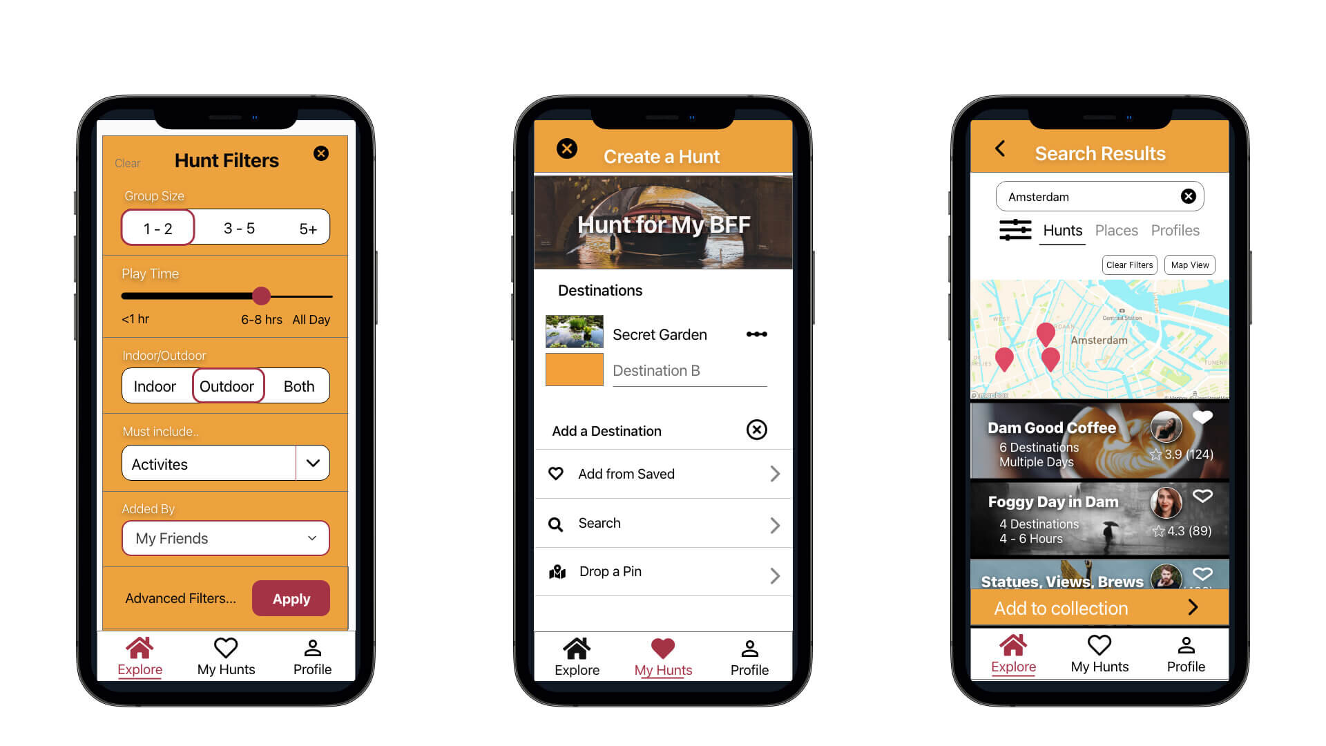
Below you can see the Home screen (left), the My Hunts screen (middle), and the third step of adding a custom location to a scavenger hunt (right).


Core Features
Search & Save
Hidden Gems makes it easy to search for and save destinations - anywhere and everywhere. Players can search for fully completed scavenger hunts, individual places, or profiles of people and brands. With an interactive map and detailed filter feature, players can find the perfect scavenger hunt for their upcoming vacation, coffeeshop on their way to work, or mountain biking trail. Once they’ve found it, they can easily save it to a collection.
Custom Scavenger Hunts
Players can create scavenger hunts for their own city or add the highlights of their previous vacations to share with friends and family. It’s also a great itinerary planning tool for their next big adventure. With three ways to add destinations to the hunt, there’s nowhere off limits. Players can search for coffee shops, drop a pin on a biking trail, or connect the dots between their saved places. This is also great for people who live in popular travel destinations who get asked for recommendations regularly.
See What Your Friends Saved
Imagine that you’re traveling to a city for the first time, say Seattle. You know that you have friends who have been to Seattle before, but you can’t exactly remember who. Simply search “Seattle” and filter “Added by Friends.” Voila! You can now see all the saved places your friends have saved in the Seattle metro. If your friends have public scavenger hunts in Seattle, you can see them there, too!
Testing
Usability Testing
Methodology
Six participants ages 20 - 55 were involved in the testing. All tests were conducted remotely and recorded using Zoom. Participants were asked to complete 12 different tasks associated with the search, filter, save, and create a hunt features.
The participants included:
Don H., 45 - 55, Coon Rapids, MN; Unemployed on disability
Taylor S., 18 - 22, Duluth, MN; Art Student
Kat P. 25 - 30, Amsterdam, NL; Instagram influencer
Mayson L. 25 - 30, Duluth, MN; Quality Assurance Coach
Allison H., 25 - 30, Duluth, MN; Director of Operations & Marketing
Nicole M. 45 - 55, Mendocino, CA; Graphic Designer / Entrepreneur
Goals and Objectives
Determine the ease with which users can create a custom scavenger hunt. This includes
finding the “Create a Hunt” button
adding a title to the hunt
adding destinations to the hunt using various methods, and
reordering the destinations of the hunt once they’ve been added.
Evaluate the users’ interactions with the search feature. We will be observing:
how users react to and interact with the interactive map,
filter results, and
search view features.
“I like that all the features I would use are all here on the screen.”
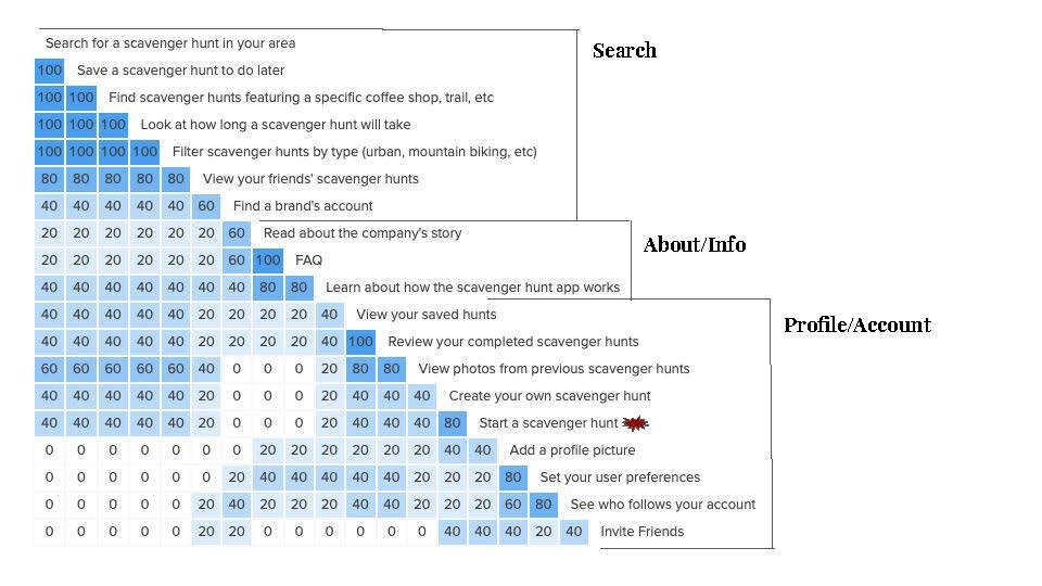
Affinity Mapping
Affinity mapping is honestly really cool. One of my greatest strengths is my ability to “connect the dots” and see patterns. This exercise of sorting statements made by participants of the usability tests helped me identify the strengths, weaknesses, and overall impressions of my design.
If I were to do this project over again, I would perform this task digitally using software instead of sticky notes. While the physicality of this practice has value, it’s often messy and difficult to maintain for a long period of time. I’d like to be able to refer back to the actual groupings of this task later continuously.


Results and Analysis
Overall, participants expressed satisfaction with the layout and navigation of the app’s home screen and customization features. Issues with the prototype are described below.
Issue 1: Participants expected to find the “Create a Hunt” feature under the “More” tab and “Profile” tab, neither of which were prototyped.
Priority: High
Suggested Change: Move the content in the “More” tab to a hamburger menu on the home screen. Add “Create a Hunt” button to Explore, My Hunts, and Profile tab.
Evidence: Three out of six participants expected to find this feature under the more tab. When asked what else they expected to be under this category, they didn’t have any other ideas, suggesting that the bottom navigation was unclear.
Click to enlarge
“I would expect it to be in My Hunts after I made it, but I wouldn’t expect to create it here.”
Issue 2: Filters layout was strong, but felt incomplete.
Priority: Medium
Suggested Change: Design the filters to answer the Who, What, When, Where, Why, and How of the scavenger hunt users are looking for. Add labels to scales.
Evidence: Four of Six participants tried to click on the “more filters” button. Two said they’d like to see filters for price, solo vs group, and traveler vs local.
Click to enlarge
“I want to know how long the hunts are going to be. Will they be an hour or all day? ”
Issue 3: No way to see where destinations are in relationship to each other after they’ve been added to the hunt.
Priority: Medium
Suggested Change: Create a map on showing the distance between destinations on the hunt.
Evidence: Two users suggested this change on their own accord during testing.
“How do I know I’m not sending them back and forth across town?”
Click to enlarge
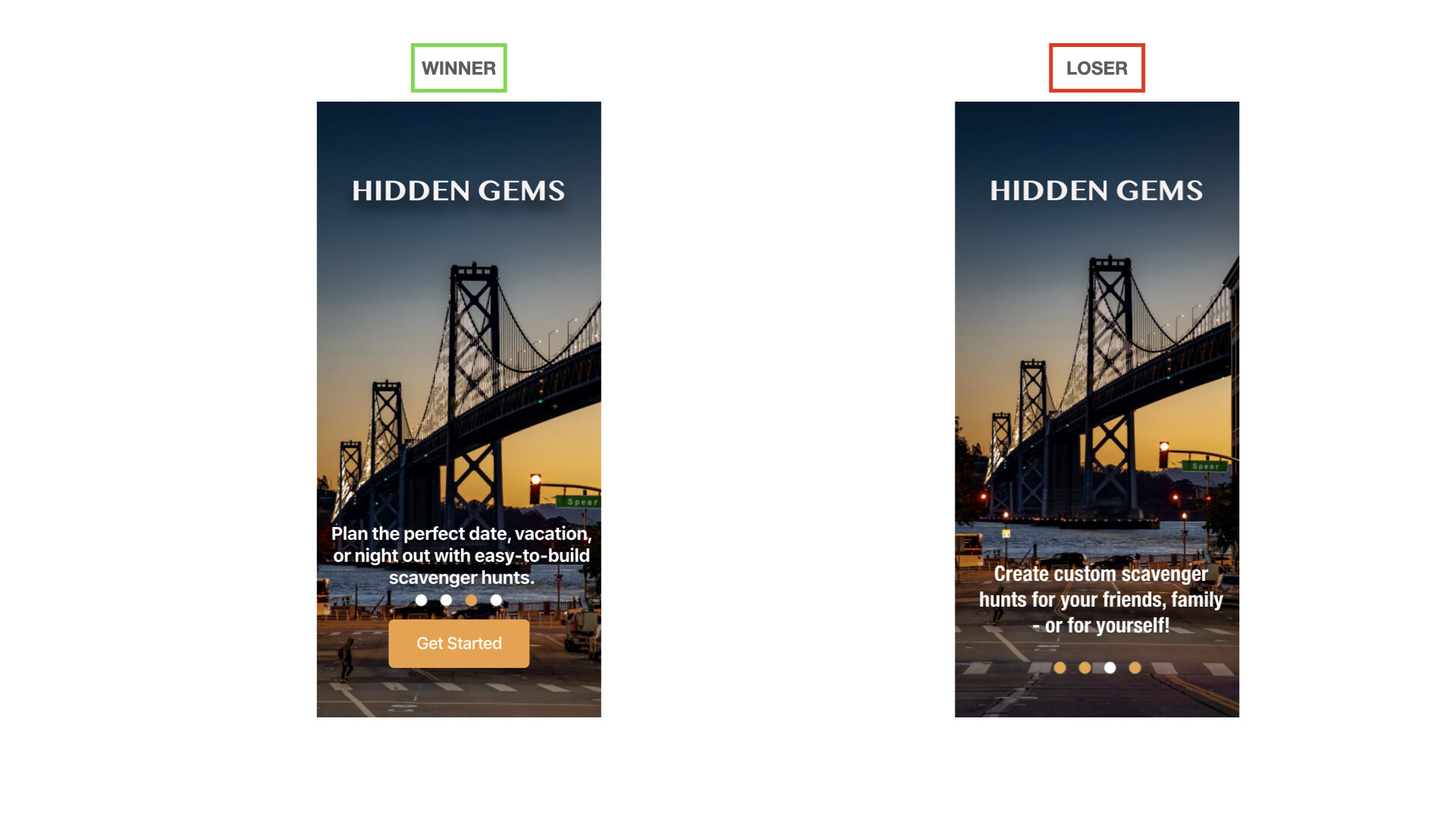
Preference Testing
Preference testing was conducted to test the clarity and descriptiveness of the text on the introduction screens.
Methodology
Testing tool: UsabilityHub
Participants: 11 participants ages 22 - 31
Results
Out of the 11 participants, 9 preferred the image on the left. Participants said that the text felt more welcoming, descriptive, and informative about how they could start using the app immediately.
Style and Reiteration
After analyzing and implementing the results of the usability and preference tests, I started thinking about visual design elements like color, typography, Gestalt principles, and other elements that make the app look “finished.”


Reiteration
As with any design project, the more time you spend with it, the more you find to improve. Here are 6 elements that underwent dramatic reiterations:
Update #1: Search Results - List View
The size of the interactive map was increased to help users easily gather more information
A much more photo-forward approach, with banner images that spread across the entire screen as opposed to three smaller images separated by whitespace. This creates a much more intentional use of the hunt’s cover photo.
The updated list view includes more high-level information including number of destinations, estimated time to complete the hunt, ratings and reviews. This gives users more information to compare their results without leaving this page.
Update #2: Search Filters
This feature began as a dropdown menu but was updated to a sheet, which reduces the cognitive load of the users
The slider was updated to conform to iOS guidelines, including labels for clarity
The “Activities” filter was updated from a grid to a dropdown menu to save screen space
Color and size were adjusted to the “Apply” button, improving the visual hierarchy of this call-to-action
Update #3: Saving Search Results
Scavenger Hunts and Places (such as cafes) can be saved to personal collections
A small pop-up menu with a lot of empty space was turned into a sheet with a grid, neatly displaying existing collections. This reduces cognitive load by only presenting users with the task at hand
Action buttons to cancel and save were created to increase clarity
Users can easily create a new collection
Update #4: Adding a Destination to a Hunt
Three equally-sized buttons were replaced with a dropdown menu, improving the visual hierarchy and decision architecture of this action
A header was added to the page to help users locate themselves in the process of creating a custom hunt
The cover photo was expanded from an image box to a banner image. Later, an overlay was added to increase contrast between image and title
Update #5: Drop a Pin Feature
A header was added to remind users of the larger task being completed (creating a custom hunt)
The logo and hamburger menu were removed because they were unnecessary and could potentially cause errors with a long recovery time
The confirmation of the dropped pin location was turned into a pop-up with a sharp contrast to increase legibility
Update #6: Sign Up Screen
A background image was added to convey a the mood of the app
Labels were added to form fields to increase accessibility
A gray overlay was added to the social login screen to increase contrast
Color was added to the Sign Up button to establish hierarchy
Conclusion
What Went Well
I was able to create a unique and useful app that solves real user problems. Several of the usability test participants said that they would use this app.
Despite having to convey significant amounts of information, I was able to maintain an intuitive and user-friendly design that doesn’t bombard the users’ visually
What Could Have Gone Better
The initial and revised sitemaps were helpful steps in the ideation process, but were quickly improved upon during the wireframing process.
I have concerns about users potentially feeling lost while creating a custom hunt. I would like to spend more time helping users locate themselves in the process or by creating a quicker method
What I Studied Afterwards
Information Architecture
Sitemaps
Design standards for iOS and Android
Accessibility Guidelines and Levels
Challenges
The challenge was to create a social scavenger hunts for real objects and locations in their own cities, independently or with groups. User research showed that it made more sense to use scavenger hunts as a method for creating itineraries with recommendations from their friends, favorite brands, and locals rather than to make a scavenger hunt app for gaming purposes. This was an unexpected but exciting turn that produced a truly unique and useful result. Users can now search, save, and share their favorite places- around town or around the world- with their friends and family. Users’ can see what places their friends liked wherever they find themselves. They can play scavenger hunts put together by mountain biking brands, popular chefs, or locals. They can even make their own hunts for when friends and family come to visit (save those PTO days for yourself!).
The most challenging part of this project was designing logical and intuitive information architecture. I really didn’t want to make my users do a ton of reading to figure out how this app works. I wanted it to feel familiar and natural. This is part of the reason why I did usability testing with a fairly low-fidelity prototype. I wanted to make sure that the very bones of this app were easy to navigate.
If I were to do this project over again, I’d spend some more time on styling pages like the Profile page. One the left you can see the profile page I created for this project. On the right you can a more stylized profile page I created.
Next Steps for This Project
Adding Single Destinations to Existing Hunts
Problem: Users won’t want to go through the entire “Create a Hunt” process if they just want to add a single destination to a scavenger hunt (during that session).
I believe that by creating a “quick add” feature for Kate and Mike, I can make it even easier and faster to create custom scavenger hunts. This feature would allow users to simply “drop” destinations to their existing scavenger hunts, similar to adding a single song to a playlist. This encourages users to continue adding to their scavenger hunts, reinforcing engagement.
By creating a timestamp of when each destination was added to the hunt, we could analyze how often users add single destinations to their existing scavenger hunts after the creation date.
A success benchmark could be whether at least 20% of users with existing scavenger hunts add more destinations at a later date using this feature.
More Areas for Further Development
A key area that still needs to be designed and tested is the actual gameplay. Once users find a scavenger hunt that they want to play, an experience needs to be designed to make it fun and engaging.
Progressive onboarding could be added to the “Create a Hunt” feature to instruct first time users how to use the “Drop a Pin” feature.
A visual indicator to help users locate themselves in the “Add a Destination” feature would be helpful.
Additional User Research and Usability Testing
There is so much more testing I’d like to do. Due to the constraints of time and budget, user research and usability testing was limited. I’d like to expand both these areas to include more diversity in regards to race, class, and geographic location.
I’d like to conduct another round of usability testing to ensure that the latest iterations are successful in resolving the errors discovered in the first round.